Auto Added by WPeMatico

Compose Multiplatform 1.5.0 Release

As of today, Compose Multiplatform 1.5.0 is available for you to use. It takes the Jetpack Compose declarative UI framework for Kotlin and extends it beyond Android to desktop, iOS, and web. The desktop version is stable, iOS is in Alpha, and support for web is experimental. For a full introduction, see the Compose Multiplatform website

Some highlights from this release are:

  1. The Dialog, Popup, and WindowInsets APIs are now in common code.
  2. On iOS scrolling, resource management and text fields have been improved.
  3. The UI testing framework has been stabilized on desktop.

This release is based on Jetpack Compose 1.5, which focuses on performance improvements. It also builds on the 1.1 release of Material Design 3. This includes new components such as date pickers and time pickers.

Try Compose Multiplatform 1.5.0

Compose Multiplatform supports Dialogs, Popups, and WindowInsets

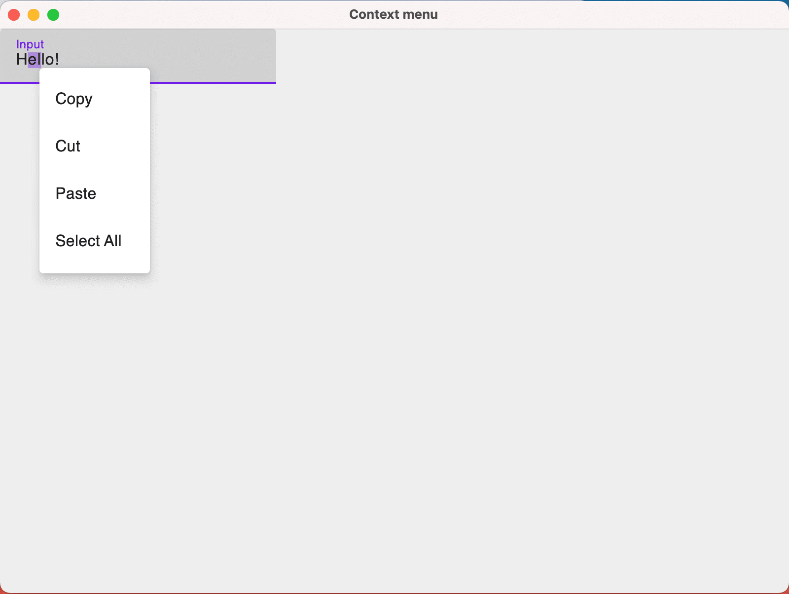
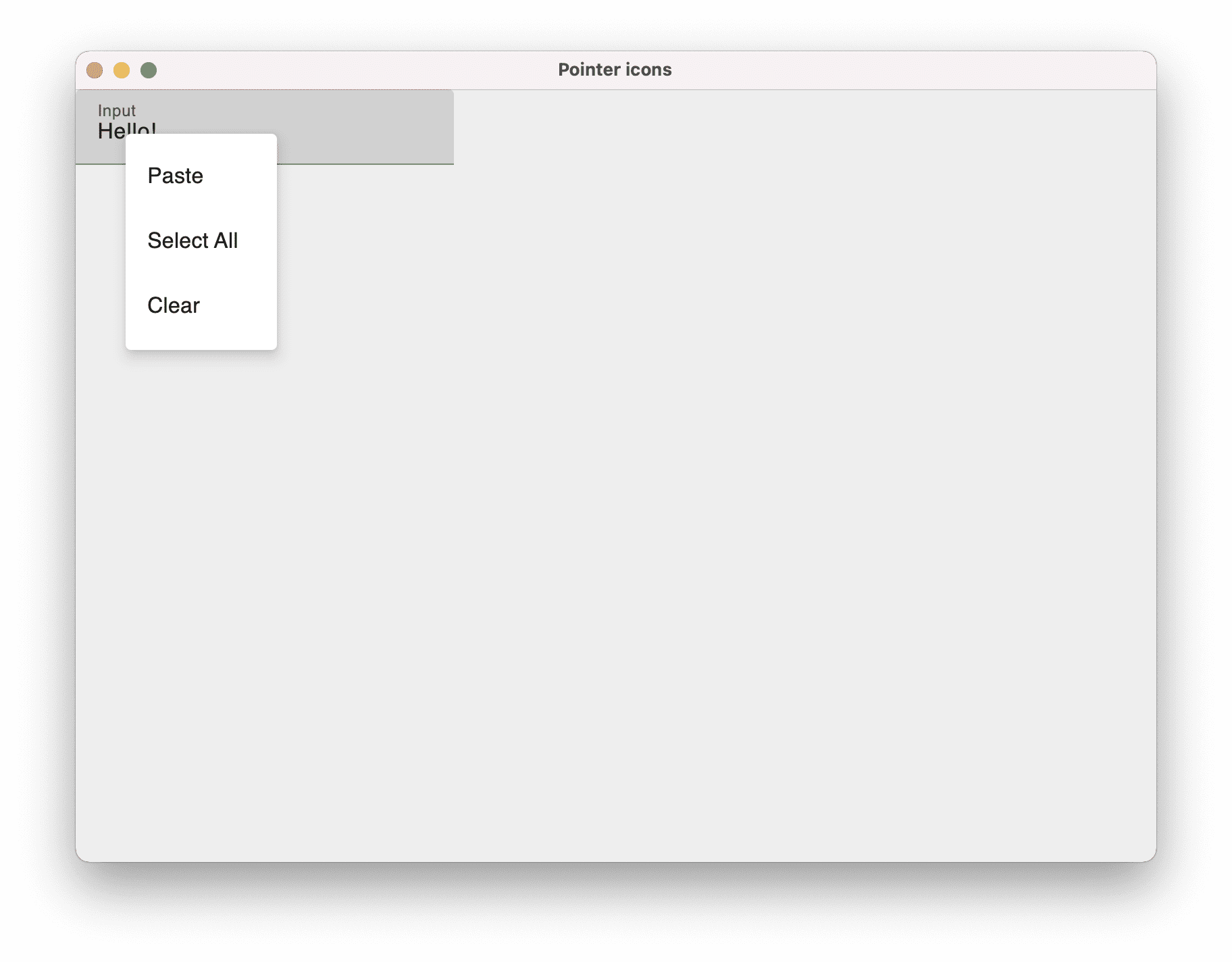
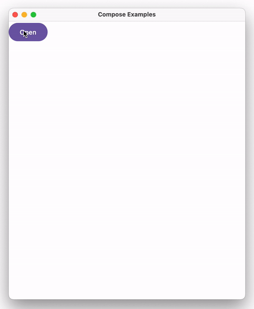
As of version 1.5, dialogs and popups are available in Compose Multiplatform. Dialogs are used for modal events, where the user makes a choice or enters some data. Popups, meanwhile, are for non-modal behavior, such as offering optional functionality.

In this release, the base types Dialog and Popup, as well as DropdownMenu and AlertDialog, are accessible from within common code. This avoids the need to provide platform-specific functionality.

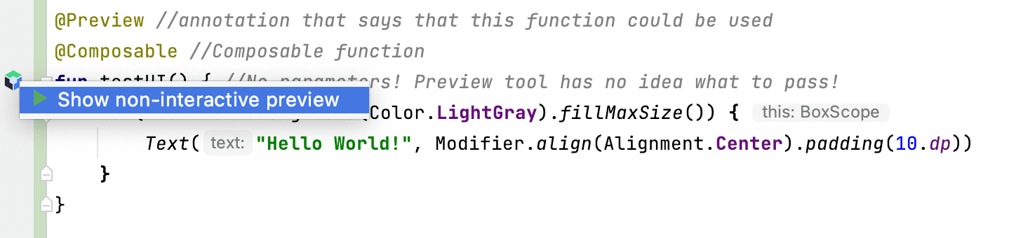
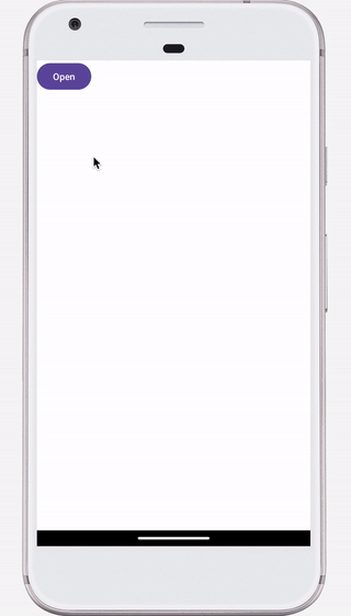
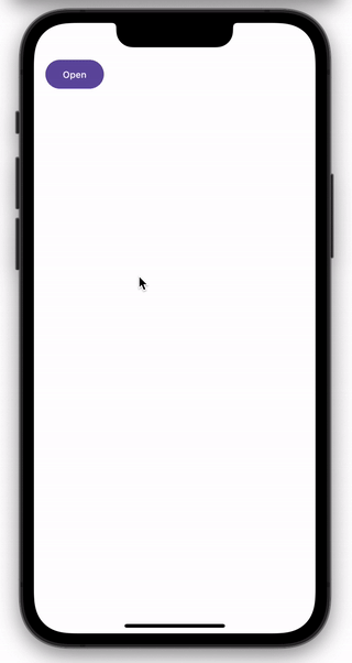
For example, the Composable below is written entirely in common code:

@Composable
fun CommonDialog() {
   var isDialogOpen by remember { mutableStateOf(false) }
   Button(onClick = { isDialogOpen = true }) {
       Text("Open")
   }
   if (isDialogOpen) {
       AlertDialog(
           onDismissRequest = { },
           confirmButton = {
               Button(onClick = { isDialogOpen = false }) {
                   Text("OK")
               }
           },
           title = { Text("Alert Dialog") },
           text = { Text("Lore ipsum") },
       )
   }
}

This is how it will appear on desktop:

Demonstration of the Dialog Boxes on Desktop

And this is how it will look on Android and iOS:

Demonstration of the Dialog Boxes on Android
            
Demonstration of the Dialog Boxes on iOS

A third feature, available in this release, is the WindowInsets API, which describes how much adjustment is required to prevent your content overlapping with the system UI. From version 1.5, this functionality is included with Compose Multiplatform, and so can be used on both Android and iOS. 

Using the WindowInsets API, you can draw background content via Compose Multiplatform behind the notch. This is done without adding a white line on top of the application. The screenshots below illustrate the difference this makes:

WindowInsets API Before and After in Compose Multiplatform

Improvements on iOS

The iOS platform was the focus of this release, and includes a wide variety of improvements. Scrolling mimics the platform’s look and feel, resource management has been simplified, and text handling is enhanced.
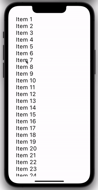
Natural scrolling

In this release, iOS scrolling is adapted to mimic native scrolling. Let’s say we have code where the number and/or size of items to be displayed exceeds the available space:

@Composable
fun NaturalScrolling() {
   val items = (1..30).map { "Item $it" }
   LazyColumn {
       items(items) {
           Text(
               text = it,
               fontSize = 30.sp,
               modifier = Modifier.padding(start = 20.dp)
           )
       }
   }
}

When scrolling, items spring from the edges of the screen, as with native iPhone applications:

Scrolling Springs on iOS

Support for Dynamic Type

The Dynamic Type feature on iOS allows a user to set their preferred font size – larger for ease of viewing or smaller to fit in more content. The text sizing used within an app should be relative to this system setting. 

This feature is now supported in Compose Multiplatform. The increments used in scaling the text are the same as those used in native applications, so the behavior will be identical.

For example, given the following Composable:

@Composable
fun DynamicType() {
   Text("This is some sample text", fontSize = 30.sp)
}

This is what will be displayed when the preferred reading size is set to the minimum:

Dynamic Type feature on iOS in Compose Multiplatform (small text)

Whereas, this is the result when the preferred reading size is at the maximum:

Dynamic Type feature on iOS in Compose Multiplatform (large text)

Support for high-refresh rate displays

In previous versions, the maximum frame rate was 60 FPS. This could result in the UI being slow and laggy on devices with 120Hz screens. From this release, frame rates of up to 120 FPS are supported.

Simplified resource management

From 1.5.0 onwards, any assets in the resources folder of an iOS source set are copied into the application bundle by default. So, for example, if you place an image file into src/commonMain/resources/, it will be copied to the bundle and is usable from your code.

If you are using CocoaPods, you no longer need to configure this behavior in the Gradle build file. You also don’t need to reinvoke podInstall to ensure assets are copied after modification. 

From this release, if you try to configure the behavior explicitly in build scripts (as shown below), then you will receive an error:

kotlin {
    cocoapods {
        extraSpecAttributes["resources"] = "..."
    }
}

For full details, and a guide to migrating existing code, please see this document.

Improved TextField

In earlier releases, there were two situations where entering text could cause unwanted behavior. From this release, TextField has been enhanced to overcome these issues.

Capitalization issues

Firstly, TextField now recognizes when the automatic capitalization of the first letter has been disabled. This is important, for example, when entering passwords. You control this behavior via the keyboardOptions argument.

To illustrate this, examine the Composable below: 

fun TextFieldCapitalization() {
   var text by remember { mutableStateOf("") }
   TextField(
       value = text,
       onValueChange = { text = it },
       keyboardOptions = KeyboardOptions(
           capitalization = KeyboardCapitalization.Sentences,
           autoCorrect = false,
           keyboardType = KeyboardType.Ascii,
       ),
   )
}

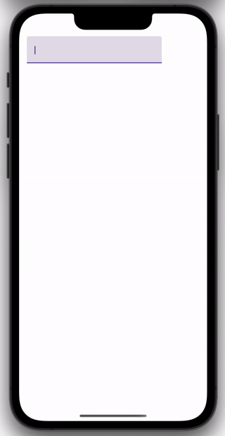
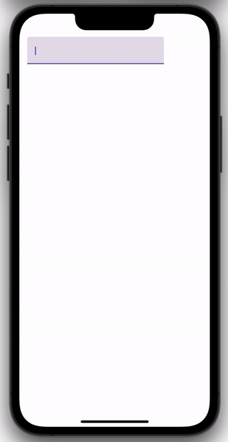
The image on the left shows what happens when the capitalization property is set to KeyboardCapitalization.None, whereas the image on the right shows what happens when the value is KeyboardCapitalization.Sentences.

Keyboard Capitalization Sentences with TextField
            
Keyboard Capitalization None

Hardware keyboards

The second situation relates to hardware keyboards. In previous versions, when using a hardware keyboard, pressing Enter resulted in multiple newlines, and pressing Backspace triggered multiple deletions. From this release, these events are now processed correctly.

Improvements on desktop

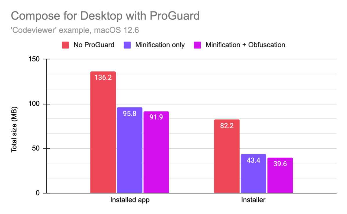
Stabilized test framework

This release stabilizes support for testing on Compose for desktop. Jetpack Compose provides a set of testing APIs to verify the behavior of your Compose code. These APIs were ported to desktop and available in previous releases, but with limitations. These limitations have now been removed, making it possible to write comprehensive UI tests for your application.

In order to provide an overview of the testing functionality, let’s create and test a simple UI. Here’s our example Composable:

@Composable
fun App() {
   var searchText by remember { mutableStateOf("cats") }
   val searchHistory = remember { mutableStateListOf<String>() }


   Column(modifier = Modifier.padding(30.dp)) {
       TextField(
           modifier = Modifier.testTag("searchText"),
           value = searchText,
           onValueChange = {
               searchText = it
           }
       )
       Button(
           modifier = Modifier.testTag("search"),
           onClick = {
               searchHistory.add("You searched for: $searchText")
           }
       ) {
           Text("Search")
       }
       LazyColumn {
           items(searchHistory) {
               Text(
                   text = it,
                   fontSize = 20.sp,
                   modifier = Modifier.padding(start = 10.dp).testTag("attempt")
               )
           }
       }
   }
}

This creates a simple UI that records search attempts:

Search App Used for Testing

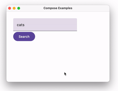
Notice that Modifier.testTag has been used to assign names to TextField, Button and the items in LazyColumn

We can then manipulate the UI within a JUnit test:

class SearchAppTest {
   @get:Rule
   val compose = createComposeRule()


   @Test
   fun `Should display search attempts`() {
       compose.setContent {
           App()
       }


       val testSearches = listOf("cats", "dogs", "fish", "birds")


       for (text in testSearches) {
           compose.onNodeWithTag("searchText").performTextReplacement(text)
           compose.onNodeWithTag("search").performClick()
       }


       val lastAttempt = compose
           .onAllNodesWithTag("attempt")
           .assertCountEquals(testSearches.size)
           .onLast()


       val expectedText = "You searched for: ${testSearches.last()}"
       lastAttempt.assert(hasText(expectedText))
   }
}

Using the Compose-specific JUnit rule we:

  1. Set the content of the UI as the App Composable.
  2. Locate the text field and button via onNodeWithTag
  3. Repeatedly enter sample values into the text field and click the button.
  4. Find all the text nodes that were generated via onAllNodesWithTag.
  5. Assert that the current number of text nodes were created, and acquire the last.
  6. Assert that this last attempt contains the expected message.

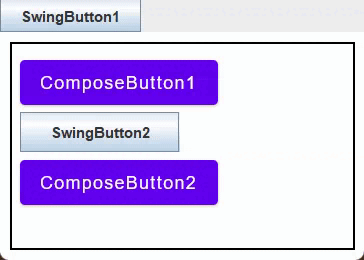
Enhanced Swing interop

This release introduces experimental support for improved rendering of compose panels inside Swing components. This prevents transitional rendering issues when panels are being shown, hidden, or resized. It also enables proper layering when combining Swing components and compose panels. A Swing component can now be shown above or beneath a ComposePanel.

To illustrate this, examine the example below:

fun main() {
   System.setProperty("compose.swing.render.on.graphics", "true")
   SwingUtilities.invokeLater {
       val composePanel = ComposePanel().apply {
           setContent {
               Box(modifier = Modifier.background(Color.Black).fillMaxSize())
           }
       }


       val popup = object : JComponent() { ... }


       val rightPanel = JLayeredPane().apply {
           add(composePanel)
           add(popup)
           ...
       }


       val leftPanel = JPanel().apply { background = CYAN }


       val splitter = JSplitPane(..., leftPanel,rightPanel)


       JFrame().apply {
           add(splitter)
           setSize(600, 600)
           isVisible = true
       }
   }
}

In this code, we create and display a Swing JFrame, with the following content:

  1. The JFrame contains a JSplitPane with a vertical divider.
  2. On the left of the split pane is a standard JPanel, colored cyan.
  3. On the right is a JLayeredPane, made up of two layers:
    • A ComposePanel containing a Box composable, colored black
    • A custom Swing component, where the text “Popup” appears within a white rectangle. This is achieved by overriding the paintComponent method.

When the property compose.swing.render.on.graphics is set to true then: 

  • The custom Swing component is displayed on top of the Box Composable. 
  • There are no transitional graphical artifacts as the slider is moved.

Swing Interop Demo Working

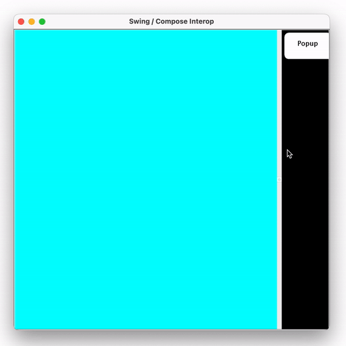
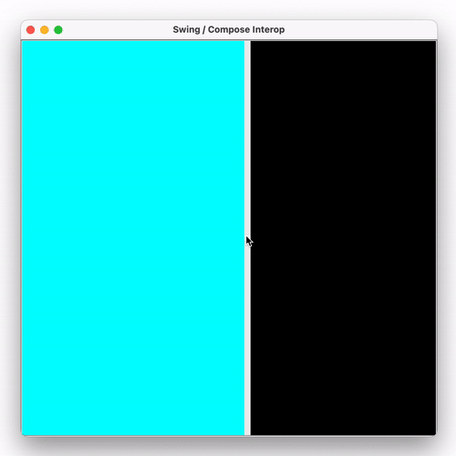
If this flag had not been set, the custom component would not be visible, and there could be transitional artifacts as the slider was moved:

Swing Interop Demo Not Working

Please share your feedback about Compose Multiplatform. We invite you to join the discussion on the Kotlin Slack in the #compose channel, where you can discuss general topics related to Compose Multiplatform and Jetpack Compose. In #compose-ios, you can find discussions about Compose Multiplatform for iOS.

Try Compose Multiplatform 1.5.0

What else to read and watch

Continue ReadingCompose Multiplatform 1.5.0 Release

Compose Multiplatform 1.2 Is Out: New Mouse and Keyboard APIs, ProGuard Support, Online Updates, and More

Starting today, Compose Multiplatform 1.2 is available for you to use! This latest version of the declarative UI framework for Kotlin brings compatibility with the latest Kotlin version and introduces several powerful features for the desktop target. Specifically, here are the highlights:

  • The newly added ProGuard support allows you to minify and obfuscate your application before shipping.
  • Focus management is being improved, resulting in better keyboard navigation through form elements.
  • A reworked API for handling mouse and keyboard input makes it more convenient to implement actions that react to clicking and dragging.
  • We are introducing official support for right-to-left languages (RTL) for layouts and input fields.
  • Swing interoperability for focus management and context menus is becoming more seamless.
  • As an alternative to the Compose Gradle Plugin, you can now package your Desktop application using the third-party tool Hydraulic Conveyor, which makes it easy to build download pages, notarize your application for multiple platforms, and integrate auto-update functionality in your application.

Let’s look at the new features in Compose Multiplatform 1.2 in detail!

Explore the Compose Multiplatform Website

Support for the ProGuard optimizer and obfuscator

Starting with the latest version of Compose Multiplatform, you can now use ProGuard to improve the performance and size of your bundled application without having to provide special configurations. ProGuard applies optimizing techniques to shrink your code, reducing the size of your final binary. It also optimizes your code, which can provide slight performance improvements by removing unnecessary function calls or object allocations. Optionally, it also allows you to apply code obfuscation to your application.

In our tests, we’ve observed that processing an application with ProGuard significantly reduced the final distribution size for our sample applications.

Enabling ProGuard significantly reduces the bundle size of our sample applications, from 136 to 91 MiB for the installed application.

Even without specifying any options in your Gradle configuration for your project, you can use the new runReleaseDistributable and packageRelease<PACKAGE_FORMAT> tasks to process and subsequently run or package your code using ProGuard.

Providing custom ProGuard rules

If your application is using reflection or generates bytecode at runtime, you may need to give ProGuard instructions on which classes should not be removed during the optimization process. You can do so by providing a standard ProGuard configuration file and configuring it in your Gradle build file in the buildTypes.release.proguard block:

compose.desktop {
    application {
        // ...
        buildTypes.release.proguard {
            configurationFiles.from("rules.pro")
        }
    }
}

If you would like to take a closer look at the ProGuard integration provided in Compose Multiplatform, take a look at the example project provided in the GitHub repository.

Improved focus management for keyboard navigation

We have reworked some of the behavior when it comes to managing focus of UI elements, which influences the way users can navigate your elements and inputs via keyboard shortcuts. Both clickable and toggleable elements (with the modifiers Modifier.clickable and Modifier.toggleable) now request focus when clicked, making navigation between focusable items work as users would expect it to (selecting the next focusable item after the one that was clicked). In addition, once an element has been focused, we have also introduced new behaviors that make it easier to use keyboard shortcuts out of the box:

  • Composables marked with Modifier.toggleable can now be toggled on and off using the spacebar.
  • The Slider composable can now be controlled via the arrow keys (incrementing values one step at a time), the Page Up and Page Down keys (moving 10% of the value range at a time), and the Home and End keys (set the value to 0% or 100% of the range respectively).
  • Menu items from DropDownMenu, CursorDropDownMenu, and ContextMenu can now be navigated via the keyboard arrows.

Mouse and keyboard API improvements

We’re also refining Compose for Desktop’s experimental APIs for working with mouse and keyboard input more conveniently. Specifically, we’re introducing the onClick and onDrag modifiers, and making it easier to access modifier keys.

Please note that the mouse and keyboard API is only available on the Desktop target of Compose Multiplatform at the moment.

New onClick modifier

As a replacement for the now deprecated Modifier.mouseClickable, we’re introducing Modifier.onClick. This new modifier gives you fine-grained control over handling clicks of any type using callbacks. Using a PointerMatcher, you can distinguish between different types of clicks (regular, double-click, long click) and the button being used (left mouse button, right mouse button, middle mouse button, etc.). You also have the option to make these callbacks conditional on specific keyboard modifier keys that need to be pressed via the keyboardModifiers lambda parameter.

Box(modifier = Modifier.size(200.dp).background(Color.Yellow)
   .onClick(
       matcher = PointerMatcher.mouse(PointerButton.Secondary), // Right Mouse Button
       keyboardModifiers = { isAltPressed }, // accept clicks only when Alt pressed
       onLongClick = { // optional
           println("Long Click with secondary button and Alt pressed")
       },
       onDoubleClick = { // optional
           println("Double Click with secondary button and Alt pressed")
       },
       onClick = {
           println("Click with secondary button and Alt pressed")
       }
   )
   .onClick { // onClick with all default parameters
       println("Click with primary button (mouse left button)")
   }
) {
   Text(text = "Box with onClick", modifier = Modifier.align(Alignment.Center))
}

If you want to take a look at this API in more detail, we have prepared a tutorial that guides you through using the different options exposed by this modifier, and that also explains how you can chain multiple onClick modifiers to separate different conditions and modifier keys.

New onDrag modifier

Using the onDrag modifier, you can specify a callback that is called on drag events. Just like onClick, it works with a PointerMatcher, meaning you can configure additional constraints, such as which mouse button the drag event should work with. Likewise, you can specify multiple onDrag modifiers that work with different mouse buttons, allowing you to implement different drag behavior for the left and right mouse buttons, for example.

var boxOffset by remember { mutableStateOf(Offset(0f, 0f)) }

Box(modifier = Modifier
   .offset {
       IntOffset(boxOffset.x.toInt(), boxOffset.y.toInt())
   }.size(200.dp).background(Color.Yellow)
   .onDrag(
       matcher = PointerMatcher.mouse(PointerButton.Secondary), // it's Primary by default, can be configured with other pointer buttons such as Secondary, Tertiary, etc.
       onDragStart = { }, // optional
       onDragEnd = { },   // optional
       onDragCancel = { } // optional
   ) {
       println("Drag offset x=${it.x} y=${it.y}")
       boxOffset += it
   }

) {
   Text(text = "Box with onDragn(using right mouse button)", modifier = Modifier.align(Alignment.Center))
}

This also sets this experimental API apart from elements such as the draggable modifier that can be found in the Android target for Compose Multiplatform, which always uses the primary button.

For more information on this API, we have provided a tutorial that includes more extensive usage examples and also illustrates advanced functionality like listening for drag and tap gestures in a PointerInputScope.

Accessing keyboard modifiers

In the context of any composable, you can now use the LocalWindowInfo.current.keyboardModifiers state which provides access to the currently pressed keyboard modifiers (Ctrl, Shift, Alt, or others). Since keyboardModifiers is a state that automatically updates when any modifier keys are pressed or released, composables that are dependent on these keyboard modifiers will recompose.

val windowInfo = LocalWindowInfo.current
var hovered by remember { mutableStateOf(false) }
val color by derivedStateOf {
  if (hovered && windowInfo.keyboardModifiers.isCtrlPressed) {
      Color.Yellow
  } else {
      Color.Gray
  }
}

Box(modifier = Modifier
   .size(200.dp)
   .background(color)
   .onPointerEvent(PointerEventType.Enter) {
       hovered = true
   }.onPointerEvent(PointerEventType.Exit) {
       hovered = false
   }
) {
   Text("Hover me and then press Ctrl", modifier = Modifier.align(Alignment.Center))
}

Support for right-to-left languages and scripts

Starting with version 1.2, Compose for Desktop now supports right-to-left languages. By default, it automatically switches layout and inputs according to the detected system language. If you are implementing behavior that depends on the direction of the script being used, you can use the LocalLayoutDirection CompositionLocal which exposes this information.

Keyboard navigation interoperability and shared context menus with Swing

Combining user interfaces built with Compose for Desktop and those built with Swing becomes a bit more convenient with version 1.2. Using a SwingPanel (which allows you to embed Swing elements in a Compose for Desktop application) or a ComposePanel (embedding Compose for Desktop in your existing Swing applications) now works seamlessly when it comes to keyboard navigation – focusable elements from both UI frameworks now get selected properly when switching via the Tab key.

Tabbing through panels

If you are adding Compose for Desktop to an existing Swing application, you can now use the same context menu for text and text fields across both parts of your application. To do so, you can use the JPopupTextMenu composable.

val localization = LocalLocalization.current
CompositionLocalProvider(
    LocalTextContextMenu provides JPopupTextMenu(owner) { textManager, items ->
        JPopupMenu().apply {
            textManager.cut?.also {
                add(
                    swingItem(localization.cut, Color.RED, KeyEvent.VK_X, it)
                )
            }
            textManager.copy?.also {
                add(
                    swingItem(localization.copy, Color.GREEN, KeyEvent.VK_C, it)
                )
            }
            textManager.paste?.also {
                add(
                    swingItem(localization.paste, Color.BLUE, KeyEvent.VK_V, it)
                )
            }
            textManager.selectAll?.also {
                add(JPopupMenu.Separator())
                add(
                   swingItem(localization.selectAll, Color.BLACK, KeyEvent.VK_A, it)
                )
            }
            ...
        }
    }
) {
    ...
}

We also provide a number of tutorials that provide more details and full samples on Swing interoperability for context menus.

Alternative app distribution with online updates via Conveyor by Hydraulic

With version 1.2, you can use the third-party tool Conveyor by Hydraulic to package your desktop app as an alternative to the Compose Gradle Plugin. Conveyor is free for open-source projects, and is also free for commercial use during its introductory period.

Like with the Compose Gradle Plugin, you can create entirely self-contained applications that come in the native formats of the platforms you are targeting and that come with their own bundled JVM. On top of that, Conveyor adds support for online updates, generating a download page (example), automatic conversion of your icons for the respective platforms, and various other features. Additionally, because Conveyor does not rely on native tooling, you can build, sign, and notarize packages from any operating system.

Conveyor is a great fit for Compose for Desktop, because it drastically simplifies distribution. That makes it smoother to provide online updates and avoid complex multi-platform CI/CD setups. On both Windows and macOS, it also provides extra conveniences for internal or developer-targeted apps: When using the default self-signing mode, the generated download page provides your users with copy-pastable commands to install the app from the terminal (example).

Wrapping up

We hope you enjoy the latest version of Compose Multiplatform and continue to build beautiful UIs for your applications! Some smaller changes didn’t make it into this release post – for a full list of all changes and improvements in Compose Multiplatform 1.2, feel free to take a look at the changelog in the repository.

Starting from version 1.2, Compose Multiplatform comes with support for multiple versions of the Kotlin compiler: The desktop target supports both Kotlin 1.7.10 and Kotlin 1.7.20. The web target currently supports Kotlin 1.7.10, and will provide support for 1.7.20 within the scope of the next minor update.

As usual, the easiest way to get started with this latest version of Compose Multiplatform is to take a look at the official tutorials – or to start exploring on your own using the Kotlin Project Wizard in IntelliJ IDEA. Have fun composing!

Explore the Compose Multiplatform Website

See also

Continue ReadingCompose Multiplatform 1.2 Is Out: New Mouse and Keyboard APIs, ProGuard Support, Online Updates, and More

Compose Multiplatform 1.0 출시!

Kotlin의 선언형 UI 프레임워크인 JetBrains Compose Multiplatform 버전 1.0이 출시되어 프로덕션 사용이 준비되었습니다! 이 프레임워크의 신규 버전이 제공하는 주요 기능은 다음과 같습니다.

  • 데스크톱에서 뛰어난 사용자 인터페이스를 지원하는 Kotlin 앱을 빠르고 효율적으로 개발할 수 있습니다.
  • 에서 모든 브라우저 API와 완벽한 상호 운용성을 갖춘 Compose for Web의 안정적인 DOM API를 사용하여 프로덕션 수준의 동적 웹 환경을 구축할 수 있습니다. Material UI 위젯은 향후 릴리스에서 지원될 예정입니다.
  • 전반적으로 다양한 플랫폼(Android 포함, Jetpack Compose by Google 호환성 사용) 간 전문 기술과 코드를 더 쉽게 공유할 수 있습니다.

하나씩 살펴보겠습니다.

웹사이트 방문

데스크톱용 Kotlin UI

꽤 오랫동안 Kotlin 데스크톱 애플리케이션의 사용자 인터페이스를 개발하려면 기존 Java UI 프레임워크를 사용해야 했습니다. 데스크톱용 모던 UI 개발 스타일을 접목한 Kotlin 라이브러리가 없었기 때문입니다. JetBrains는 Compose Multiplatform을 선보여 변화를 이끌고자 합니다. 이 프레임워크가 Kotlin 앱 UI 개발 경험을 개선하는 방식을 알아보겠습니다.

사용자 인터페이스 개발을 위한 선언형 접근 방식

Compose Multiplatform은 선언형이므로 코드에 앱의 UI 구조가 반영되며, 모델에서 뷰로 데이터 복사 또는 UI 갱신 로직 개발 등의 작업을 고민할 필요가 없습니다. 프레임워크로 모두 처리되므로, UI 개발은 즐거운 경험입니다. 다음 예시의 경우 TextField의 내용이 수정되면 추가 코딩 없이도 Text 라벨 내용이 업데이트됩니다.

var text by remember { mutableStateOf("Hello, World!") }
Column {
   Text(text) //text label
   TextField(text, {text = it}) //text field
}

특히 React 또는 Jetpack Compose by Google과 같은 선언형 UI 프레임워크를 사용해본 경우, Compose Multiplatform을 쉽게 시작할 수 있습니다. Compose Multiplatform은 이와 동일한 많은 기능을 지원하므로 부담 없이 편안하게 사용할 수 있습니다.

하드웨어 가속으로 우수한 런타임 성능

모던 사용자 인터페이스에서 성능이 중요합니다. 따라서 Compose Multiplatform 속도 개선을 위해 최선을 다하고 있습니다. Compose Multiplatform은 Skia를 사용합니다. Skia는 모던 브라우저를 포함하여 성능이 중요한 다수의 애플리케이션에서 사용되는 최적화된 그래픽 라이브러리입니다. 즉, Compose Multiplatform은 DirectX, Metal 및 OpenGL 등 데스크톱의 모든 주요 하드웨어 가속 엔진을 지원합니다. 하드웨어 가속이 지원되지 않는 환경에서는 Compose가 최적화된 소프트웨어 렌더러와 함께 제공됩니다.

미리보기 도구를 통해 반복 주기 단축

UI 개발에서 가장 긴 시간이 소요되는 작업 중 하나는 애플리케이션이 완벽하게 보이도록 다시 빌드하는 과정입니다. Compose Multiplatform IDEA 플러그인을 활용하면 이 과정이 간소화됩니다. 기본 제공 라이브 미리보기 기능을 통해 UI 구성 요소를 세밀하게 조정하고, 애플리케이션을 다시 빌드하거나 시작하지 않고도 여러 개의 반복을 생성할 수 있습니다. 이로써 개발 주기가 대폭 단축됩니다.

자동 애플리케이션 패키징으로 자신 있게 선보이는 데스크톱 앱

사용자에게 애플리케이션을 제공하려면 적절한 개발뿐 아니라 적절한 패키징도 필요합니다. Compose Multiplatform은 이에 대한 지원도 제공합니다. Gradle 플러그인은 MacOS용 서명 및 공증을 비롯하여 msi, dmgdeb 형식으로 애플리케이션 패키징을 지원합니다.

Android 및 Java UI 프레임워크의 Jetpack Compose와 상호 운용성

Google에서 제작한 네이티브 UI 빌드용 Android 모던 툴킷인 Jetpack Compose는 모바일 개발자 사이에서 지속적으로 인기를 끌고 있습니다. Jetpack Compose를 사용해본 경험이 있다면 Compose Multiplatform은 쉽게 사용할 수 있습니다. 두 프레임워크가 API의 상당 부분을 공유하기 때문입니다.

사용자 인터페이스가 일반적인 Java UI 프레임워크로 빌드한 데스크톱 애플리케이션을 다루는 경우, Compose Multiplatform에서 사용하기 위해 코드를 완전히 처음부터 다시 작성할 필요가 없습니다. Compose Multiplatform은 상호 운용성이 매우 뛰어나므로 Compose로 작성된 UI 구성 요소를 기존 Java UI에 추가할 수 있습니다. Compose Multiplatform으로 새로운 앱을 빌드하는 경우에도 기존 Java 컨트롤을 추가할 수 있습니다.

Compose Multiplatform 마법사로 빠른 시작 및 실행

이제 Compose Multiplatform을 매우 빠르게 시작할 수 있습니다. IntelliJ IDEA 2021.1+에서 클릭 몇 번만으로 간단한 Compose Multiplatform 프로젝트 생성이 가능합니다.

Compose 데스크톱 애플리케이션을 보여주는 New Project(새 프로젝트) 마법사 예시

또한 다양한 튜토리얼을 통해 Compose Multiplatform 데스크톱 대상을 알아볼 수 있습니다.

Compose for Web

Compose Multiplatform은 데스크톱 작업 외에도 DOM 작업을 위한 강력한 선언형 Kotlin/JS API를 제공합니다.

또한 다양한 DOM API, CSS-in-JS 기본 지원, SVG 지원, 타입 지정된 입력 등 모던 웹 프레임워크에 필요한 모든 기능을 제공합니다. Compose Multiplatform의 웹 대상은 Kotlin만으로 작성되었으며 Kotlin의 타입 시스템과 관용구를 최대한 활용합니다. 따라서 다른 Kotlin 대상에서 이미 사용된 동일한 개발 워크플로를 활용할 수 있습니다.

멀티플랫폼 지원

Compose Multiplatform을 사용하면 (직접 지원되는) 데스크톱 및 웹 플랫폼으로 대상이 한정되지 않습니다. Google에서 개발한 유명 UI 프레임워크인 Jetpack Compose를 사용해 Android를 대상으로 지정할 수도 있습니다. 두 프레임워크는 공통 API와 Core를 공유하므로, 완벽한 상호 운용성을 제공합니다. 즉, 공통 UI 및 상태 관리 코드를 다시 작성하지 않아도 됩니다. 한 번 작성한 후 필요할 때 여러 플랫폼에서 다시 사용할 수 있습니다.

기존 Android 애플리케이션을 데스크톱이나 웹으로 가져오는 작업도 Compose Multiplatform을 사용하면 매우 간편합니다. Kotlin 프로젝트 하나로 애플리케이션의 모든 대상을 관리할 수 있습니다.

Compose를 통해 여러 플랫폼을 대상으로 하는 앱 빌드를 빠르게 시작하려면 IntelliJ IDEA 2021.1+에서 Kotlin 프로젝트 마법사를 사용해 보세요.

당장 멀티플랫폼 애플리케이션을 개발할 필요가 없더라도, 플랫폼 한 곳에서 습득한 지식과 전문 기술이 다른 플랫폼에서 유용하게 쓰일 수 있습니다.

베타 이후 변경 사항

Compose Multiplatform 1.0 버전은 이 프레임워크를 프로덕션 애플리케이션에서 사용할 준비가 되었는지 확인하는 데 초점을 맞춘 버전입니다. 결과적으로 이번 릴리스에서 중요한 이슈와 버그가 수정되었으며, 품질과 안정성도 개선되었습니다.

실제 프로덕션 경험

Compose Multiplatform은 오늘 출시되었음에도 일부 프로덕션에서 이미 활용된 바 있습니다. 예를 들어, JetBrains는 2021년 초부터 Jetbrains Toolbox App(https://www.jetbrains.com/toolbox-app/)에 Compose Multiplatform을 적용했습니다. JetBrains IDE용 관리 애플리케이션인 Toolbox App은 매월 1,000,000명 이상의 활성 사용자를 보유하며, 4개월 전 C++ 및 Electron에서 Compose Multiplatform으로 완전히 마이그레이션되었습니다.

마무리

Kotlin 개발자는 이제 Compose Multiplatform이라는 강력한 프레임워크를 통해 데스크톱과 웹 애플리케이션 모두에 적합한 아름다운 UI를 생성할 수 있습니다.

지금 바로 Compose Multiplatform을 사용해 보세요! 공식 튜토리얼에서 가장 간편한 사용 방법을 확인할 수 있습니다. IntelliJ IDEA 2021.1+에서 기본으로 제공되는 Kotlin 프로젝트 마법사를 사용하여 첫 Compose Multiplatform 프로젝트를 생성하고 Kotlin으로 선언형 사용자 인터페이스 빌드를 시작하세요.

여러분의 마음에 드셨으면 좋겠습니다!

게시물 원문 작성자

Sebastian Aigner

Continue ReadingCompose Multiplatform 1.0 출시!

JetBrains Toolbox 사례 연구: 100만 사용자를 Kotlin 및 Compose Multiplatform으로 이동

JetBrains의 Toolbox 팀 리더인 Victor Kropp이 데스크톱에서 Kotlin과 Compose Multiplatform을 사용하게 된 사연을 전해 드립니다.

JetBrains Toolbox App은 JetBrains IDE를 사용하여 개발 작업을 수행하기 위한 단일 진입점으로, 도구 및 프로젝트를 위한 제어판 역할을 하며 JetBrains IDE를 빠르고 쉽게 설치 및 업데이트할 수 있게 해줍니다. 2015년 해커톤 프로젝트에서 시작된 이 애플리케이션은 현재 월 100만 명의 실 사용자에게 서비스를 제공하여 JetBrains 제품과 함께 작업 생산성을 높이는 데 도움을 주고 있습니다.

Toolbox 팀이 이 애플리케이션을 C++ 및 JavaScript에서 Kotlin 및 Compose Multiplatform으로 완벽하게 마이그레이션한 후, 코드 작업과 관리를 더 간편하게 수행하고 아티팩트 크기를 줄여 런타임 성능을 개선할 수 있었다는 이야기를 읽어보세요.

JetBrains의 Toolbox 팀을 이끄는 Victor Kropp로부터 직접 들으려면 Talking Kotlin #107을 확인하세요.

Victor씨, JetBrains Toolbox에서 사용하는 아키텍처와 기술 스택을 소개해줄 수 있나요?

Toolbox App은 일반적인 클라이언트-서버 애플리케이션입니다. 이 데스크톱 앱은 서버에서 사용 가능한 도구 목록을 요청하여 사용자에게 보여주고 필요할 경우 JetBrains 제품 업데이트를 다운로드합니다. 애플리케이션의 서버 측 부분은 처음부터 Kotlin으로 구현했습니다. 그러나 데스크톱 애플리케이션은 달랐습니다.

2015년에 JetBrains Toolbox용 데스크톱 앱을 빌드하기 시작했을 때 C++를 사용하여 비즈니스 로직을 구현하고 React 및 HTML/CSS/JS와 함께 Chromium Embedded Framework를 사용하여 사용자 인터페이스를 빌드했습니다. 이러한 선택을 할 당시에는 Kotlin 1.0이 아직 출시되지 않았고 Java 9와 함께 제공된 모듈식 JDK도 없었습니다. 고작 작은 도우미 애플리케이션을 위해 수백 메가바이트의 JRE(Java Runtime Environment)를 번들로 제공할 여유도 없었고 사용자들에게 환경을 수동으로 설정해야 하는 번거로움을 안겨주고 싶지도 않았습니다. 그래서 완전히 다른 접근방식을 선택해야 했죠.

2021년에 이르러 사용자 인터페이스를 React에서 Compose Multiplatform, 더 구체적으로는 Compose for Desktop으로 마이그레이션하여 이 데스크톱 애플리케이션을 100% Kotlin으로 만드는 마지막 단계를 완료했습니다.

Compose for Desktop 웹사이트 방문하기

해당 제품에서 Kotlin과 라이브러리를 어떻게 사용하시나요?

Kotlin으로 마이그레이션을 완료하면서 모든 곳에서 사용하고 있습니다. 사용자 인터페이스를 지원하는 Compose for Desktop 외에도 모든 비동기 작업에 kotlinx.coroutines를 정말 많이 사용합니다. Toolbox App은 수많은 JSON 객체를 처리하므로 이에 따라 저희도 kotlinx.serialization을 (역)직렬화에 사용합니다.

서버 측은 최대한 단순하게 유지됩니다. 사실 여러분이 생각하시는 것과는 달리 이것은 HTTP 서버가 아닙니다. 설치 가능한 도구에 대한 모든 정보와 설명(Toolbox에서는 ‘피드’라고 함)은 정적으로 생성되며 CDN에서 JSON 파일로 제공됩니다. 피드가 자주 변경되지는 않으므로 저희는 TeamCity에서 지속적 배포 파이프라인의 일부로 새 버전의 도구가 출시될 때만 이를 업데이트합니다. 제너레이터는 지원되는 각 제품이 빌드될 때마다 자동으로 트리거되는 ‘빌드 구성'(작업을 나타내는 TeamCity 명칭)으로 호출되는 간단한 명령줄 Kotlin 프로그램입니다. 두 번째 작업에서는 새로 생성된 모든 피드를 주기적으로 병합하고 오래된 피드를 폐기하고 유효성 검사를 수행합니다.

Toolbox 팀이 데스크톱용 애플리케이션 개발에 Kotlin을 사용하기로 결정한 이유는 무엇인가요?

Compose for Desktop으로 이전하기 전에는 Chromium Embedded Framework를 사용하여 Toolbox App용 사용자 인터페이스를 빌드했고 비즈니스 로직에 기본 C++를 사용하여 모든 주요 데스크톱 운영 체제를 쉽게 지원할 수 있었습니다. (그 후로 많은 것이 바뀌었고 2020년에는 모든 C++ 비즈니스 로직을 JVM에서 실행되는 Kotlin으로 옮기기로 결정했습니다.)

2015년 당시에는 프로젝트를 시작하는 데 좋은 선택이었습니다. JetBrains에서 빌드한 웹 UI 구성 요소 라이브러리인 Ring UI의 구성 요소를 재사용할 수 있었습니다. 또한 저희는 웹 개발과 React 작업에 이미 많은 경험을 가지고 있었습니다.

그러나 단점도 없지 않았습니다.

  • Chromium Embedded Framework는 리소스 소비가 많은 것으로 잘 알려져 있습니다. 유휴 상태일 때도 JetBrains Toolbox는 최소 200MiB의 RAM을 사용하곤 했습니다. 또한 창이 보이지 않을 때 전체 프레임워크를 언로드할 수 없었습니다. 사용자가 앱과 상호 작용하려고 할 때 몇 초 정도 지연이 발생하기 때문입니다.
  • 저희에게는 단일 데스크톱 애플리케이션 내부에 완전한 클라이언트-서버 아키텍처가 필요했습니다. 임베디드 웹 UI와 비즈니스 로직은 서로 다른 언어로 서로 다른 사람에 의해 작성되었습니다. 이로 인해 개발 프로세스가 복잡해졌고 애플리케이션 내에서 수 메가바이트의 JSON을 주고 받기 위한 리소스가 필요했으며 이미 가지고 있던 데이터의 (역)직렬화에 CPU 리소스가 소진되었습니다.

이러한 상황은 애플리케이션을 100% Kotlin으로 이전한 후 크게 개선되었습니다.

  • Compose for Desktop은 리소스를 훨씬 적게 사용합니다. Compose 프레임워크는 JavaScript 구현에 비해 더 나은 런타임 성능을 제공하며 백그라운드에서 유휴 상태로 실행될 때 앱에서 사용하는 RAM을 크게 줄일 수 있었습니다.
  • 단일 언어를 사용한다는 것은 모든 개발자가 컨텍스트를 전환하지 않고 처음부터 끝까지 기능을 개발할 수 있음을 의미합니다. 더 빠르고 실수도 적게 발생하며 개발자 간에 원활한 지식 공유가 가능합니다. 또한 전체 애플리케이션이 메모리의 데이터에 대해 동일한 표현을 사용하므로 추가 (역)직렬화 단계가 필요하지 않습니다.

Toolbox에 Kotlin을 도입한 경험에 대해 말씀해 주시겠어요?

저희 앞에는 해결해야 할 많은 과제가 있었습니다. 우선, 만들어진 지 5년이 된 코드베이스를 모든 기능과 문제점을 포함한 상태로 다른 스택으로 마이그레이션해야 했습니다. 애플리케이션의 핵심 요소가 의도대로 작동하도록 모든 유닛 테스트를 마이그레이션했습니다. 그러나 저희 애플리케이션에는 에코시스템마다 확연히 다른 외부 종속 요소가 많이 필요합니다. 어떤 부분은 이전 구현에서 작동하지 않다가 새 구현에서는 작동하기 시작했습니다. 저희가 아무 조치도 취하지 않았는데도 말이죠. 이유는 단순히 새로운 종속 요소가 이를 지원했기 때문입니다. 그러나 당연히 작동하리라 여겼던 다른 것들은 더 이상 작동하지 않았습니다. 공개 릴리스가 출시된 후에도 이러한 차이점을 파악하지 못한 경우도 있었습니다. 두 범주의 사례는 시스템 트레이(메뉴 모음) 아이콘 또는 프록시 서버 및 SSL 인증서와 같은 운영 체제 통합의 다양한 측면들입니다. 다른 한편으로, Toolbox의 ‘Projects‘(프로젝트) 탭에서 IntelliJ IDEA의 프로젝트 검색을 지원하는 코드를 재사용하거나 특정 엔터프라이즈 설정을 탐지하는 것과 같이 JetBrains의 다른 팀이 작성한 Kotlin 코드를 재사용할 수도 있습니다.

저희는 Compose for Desktop를 공식 발표 전부터 사용하기 시작했기 때문에 프레임워크에서 발생하는 문제를 가장 먼저 접하는 경우가 많았습니다. Compose for Desktop의 최초 사용자로서, 저희는 사용 시작과 동시에 모든 종류의 문제를 확인하고 Compose Multiplatform 팀의 동료에게 모든 문제를 보고했습니다. 그들은 많은 도움을 주었고 빠르게 대응했으며 모든 문제를 매우 신속하게 수정했습니다. 심지어 같은 날 수정 사항이 포함된 새 릴리스를 받는 경우도 있었습니다. 매우 인상적이었죠! 또한 Compose를 채택할 때, 그리고 프레임워크에서 어려움을 겪고 있을 때도 많은 도움을 주었습니다.

저희는 이전 설계를 완벽하게 복제할 수 있었습니다. Compose는 언뜻 보기에 HTML/CSS에 비해 더 적은 기본 레이아웃 프리미티브를 제공하는 것 같지만 간단한 수평 및 수직 스택(Compose의 행 및 열)만으로 이미 모든 요구사항의 99%가 충족된다는 사실을 금세 알게 되었습니다. 처음 시작할 때 Compose for Desktop에는 SVG 그래픽 지원과 같은 일부 기능이 여전히 누락되어 있었으나 Compose 팀의 동료들이 고맙게도 이러한 부족한 부분을 매우 신속하게 해결해주었습니다.

처음에는 애플리케이션 전체에서 Compose의 Material 구성 요소를 사용했습니다. 이 구성 요소는 매우 다각적으로 고려하여 만들어졌지만 터치 인터페이스에 중점을 두고 있습니다. 이 때문에 모든 요소에 많은 여백이 있고(손가락으로 쉽게 누를 수 있도록), 마우스오버 상태가 없으며(터치 디스플레이에는 이러한 동작이 없으므로), 매우 눈에 띄는 시각적 터치 피드백이 제공됩니다. 데스크톱에서는 마우스를 가져가면 구성 요소가 반응하고 클릭에 대한 시각적 피드백이 현재 요소에만 영향을 미치는(손가락으로 가려지지 않으므로) 등 상황이 많이 다릅니다. 이 때문에 저희는 Material 구성 요소를 데스크톱에서 더 잘 작동하는 자체 구성 요소로 교체하고 있습니다. 또한 향후에는 구성 요소 라이브러리를 오픈 소스로 공개할 계획이 있으므로 계속 지켜봐 주시기 바랍니다.

Compose for Desktop을 선택하기 전에 다른 UI 프레임워크를 고려하셨나요?

한 가지 대안은 애플리케이션을 완전한 기본 인터페이스로 변환하는 것이었지만, 이렇게 했다면 기능마다 3배는 더 많은 노력이 필요했을 겁니다. 저희는 크로스 플랫폼인 동시에 보기에도 좋으며 Kotlin과 잘 작동하는 프레임워크를 원했습니다.

Swing은 너무 오래되었고 JavaFX는 사용 저변이 아직 부족하다고 느꼈습니다. 이것이 당시에 발표된 지 얼마 되지 않았음에도 불구하고 Compose for Desktop을 선택한 이유입니다. 해당 팀에게 직접적 지원을 받고 피드백이 순환적으로 긴밀하게 이루어진다는 점도 큰 이유를 차지했죠.

Kotlin이 해당 제품에 가져온 가장 큰 이점은 무엇인가요?

일상 작업이 훨씬 간편해졌습니다. 이제 전체 애플리케이션에서 동일한 언어를 사용하므로, 팀의 개발자들이 이전보다 코드와 지식을 더 잘 공유할 수 있게 되었습니다. 또한 C++ 및 JavaScript 대신 Kotlin으로 작성하면서 일하는 재미가 훨씬 커졌습니다!

저희 독자들에게 하고 싶은 조언이나 권장 사항이 있나요?

기존 애플리케이션을 새 프레임워크로 전환하려고 한다면 마이그레이션의 복잡성을 얕잡아보면 안 됩니다. 거의 처음부터 새로운 애플리케이션을 작성하는 것과 다르지 않습니다! 기능뿐만 아니라 의도적이든 아니든 앱 동작의 사소한 뉘앙스까지도 놓치지 않고 다시 구현해야 하거든요.

저는 Compose for Desktop이 2021년에 크로스 플랫폼 데스크톱 애플리케이션을 만드는 주된 방법이 될 것이라고 굳게 믿습니다. 유사한 기술과 비교할 때 Kotlin은 JVM에서 검증된 에코시스템에 대한 액세스를 제공하고 Dart 및 Flutter보다 채택률이 훨씬 높으며 React/JS를 사용하는 Electron보다 훨씬 효율적입니다.

Compose for Desktop으로 첫 데스크톱 앱 빌드하기

Victor Kropp은 JetBrains Toolbox App의 팀장입니다.

게시물 원문 작성자

Sebastian Aigner

Continue ReadingJetBrains Toolbox 사례 연구: 100만 사용자를 Kotlin 및 Compose Multiplatform으로 이동

JetBrains Toolbox Case Study: Moving 1M users to Kotlin & Compose Multiplatform

Victor Kropp, the Team Lead for the Toolbox team at JetBrains, shares the story of adopting Kotlin and Compose Multiplatform on desktop.

The JetBrains Toolbox App is the single entry point for developing using JetBrains IDEs. It serves as a control panel for tools and projects, and makes installing and updating JetBrains IDEs quick and easy. Originally started in 2015 as a hackathon project, the application now serves one million monthly active users, and helps them be more productive with their JetBrains products.

Read on to understand how the Toolbox team moved their application from C++ and JavaScript to 100% Kotlin and Compose Multiplatform, and ended up making their code easier to maintain and work with while shipping smaller artifacts with better runtime performance.

To hear the story directly from Victor Kropp, who leads the Toolbox team at JetBrains, check out Talking Kotlin #107:

Victor, can you introduce the architecture and tech stack used by JetBrains Toolbox?

The Toolbox App is a typical client-server application. The desktop app requests a list of available tools from the server, shows it to the user, and downloads updates for JetBrains products when required. We implemented the server-side part of our application in Kotlin from the very beginning. The desktop application, however, was a different story.

When we started building the desktop app for JetBrains Toolbox back in 2015, we used C++ to implement its business logic and used the Chromium Embedded Framework together with React and HTML/CSS/JS to build the user interface. We made this choice at a time when Kotlin 1.0 hadn’t been released yet – and neither was the modular JDK, which came with Java 9. We couldn’t afford bundling a Java Runtime Environment (JRE) weighing hundreds of megabytes for our small helper application, and we didn’t want to trouble our users with having to manually set up their environment. So, we chose a completely different approach.

In 2021, we completed the final step of making the desktop application 100% Kotlin by migrating the user interface from React to Compose Multiplatform, more specifically Compose for Desktop.

Visit the Compose for Desktop website

How do you use Kotlin and its libraries in your product?

With the migration to Kotlin completed, we use it everywhere. Besides Compose for Desktop powering the user interface, we make heavy use of kotlinx.coroutines for all asynchronous jobs. The Toolbox App manipulates a lot of JSON objects, so we naturally use kotlinx.serialization for (de)serialization.

The server side is kept as simple as possible. In fact, it isn’t an HTTP Server as you might imagine it. All of the information and descriptions for installable tools (called “feeds” in Toolbox) are generated statically and served as JSON files from the CDN. They don’t change often, so we update them only when a new version of any tool is released as part of the continuous delivery pipeline on TeamCity. The generator is a simple command line Kotlin program that is invoked as a “build configuration” (TeamCity’s name for a job), which is automatically triggered on each build of every supported product. A second job then periodically merges all newly generated feeds, discards the outdated ones, and performs validation.

Why did the Toolbox team decide to use Kotlin for Desktop application development?

Before moving to Compose for Desktop, we used the Chromium Embedded Framework to build the user interface for the Toolbox App, and using native C++ for our business logic helped us support all major desktop operating systems easily. (Since then, many things have changed, and we made the decision to move all C++ business logic to Kotlin running on the JVM in 2020.)

Back in 2015, those were great choices to kickstart the project! We were able to reuse components from Ring UI, a library of web UI components built by JetBrains. We also already had a lot of previous experience in web development and working with React.

However, it had its disadvantages:

  • The Chromium Embedded Framework is known for its resource consumption. Even when idle, JetBrains Toolbox would use at least 200 MiB of RAM. We also couldn’t unload the whole framework when the window was invisible, because it would result in a multi-second delay for our users when trying to interact with the app.
  • We needed a full-blown client-server architecture inside a single desktop application. The embedded web UI and the business logic were written in different languages and by different people. This complicated the development process and required the resources to send megabytes of JSON back and forth inside the application, using up CPU resources on the (de)serialization of data that was already there.

After moving our application to 100% Kotlin, that situation has improved significantly:

  • Compose for Desktop is now much less resource intensive. The Compose framework provides better runtime performance compared to our JavaScript implementation, and when running idly in the background, we managed to greatly reduce the RAM used by the app.
  • Using a single language means that every developer can make a feature from start to finish without switching contexts. It is faster, less error prone, and improves knowledge sharing among developers. The entire application also uses the same representation for data in memory, skipping the need for extra (de)serialization steps.

Can you share your experience of introducing Kotlin to your Toolbox?

We faced many challenges. First of all, we needed to migrate a five year-old codebase, with all its features and quirks, to a different stack. To ensure that the core of our application works as intended, we migrated all of our unit tests. However, our application requires a lot of external dependencies, which obviously vary in different ecosystems. Some things didn’t work in the previous implementation and started working in the new one without any action from our side, simply because the new dependency supported them. However, other things we took for granted stopped working. In some cases, we didn’t know about those differences until after a public release. Examples for both categories are the different aspects of operating system integration, like the system tray (menubar) icon, or proxy servers and SSL certificates. On the other hand, it also allowed us to reuse Kotlin code written by other teams at JetBrains, like reusing the code powering IntelliJ IDEA’s project search in the Toolbox’s “Projects” tab or detecting specific enterprise setups.

We started using Compose for Desktop before it was even publicly announced, so we were often the first to encounter any issues that arose with the framework. As pioneers of Compose for Desktop, we noted all sorts of problems when we started, and reported all of them to our colleagues in the Compose Multiplatform team. They were very helpful and responsive and fixed all of them very quickly. At times, we were able to get a new release with a fix on the same day – very impressive! They also greatly helped us with the adoption of Compose and in cases where we were struggling with the framework.

We were able to make a full clone of our previous design. At first glance, Compose offers fewer layout primitives compared to what we had in HTML/CSS, but it quickly became apparent that simple horizontal and vertical stacks (Row and Column in Compose) already covered 99% of all our needs. When we first started, Compose for Desktop was still missing some pieces, like support for SVG graphics, but our colleagues from the Compose team helped us cover these needs very quickly.

Initially, we used Compose’s Material components throughout the application. These are very well-thought-out components, but they focus on touch interfaces. This means that all elements have large paddings (so they can be easily pressed with a finger), don’t have hover states (given there is no such thing on touch displays), and have very prominent visual touch feedback. On desktop, the story is usually quite different, as components react when hovered over, and the visual feedback for clicks only affects the current element (because it is not covered by a finger). Because of that, we are replacing Material components with our own which work better on desktop. We also have plans to open-source our components library in the future, so stay tuned for that.

Did you consider any other UI frameworks before choosing Compose for Desktop?

One alternative would have been to convert the application to a fully native interface, but it would have required three times more effort per feature. We wanted something that would be cross-platform, look nice, and work well with Kotlin.

We felt that Swing was too old and the usage of JavaFX isn’t sufficiently widespread. That’s how we landed on Compose for Desktop, despite it just being announced at the time. Getting direct support from the team and a tight feedback loop also turned out to be a huge plus.

What are the biggest benefits that Kotlin has brought to your product?

Everyday work is just much simpler now. We use the same language across the entire application, meaning the developers on our team share code and knowledge better than before. We’re also having much more fun writing Kotlin instead of C++ and JavaScript!

Do you have any advice or recommendations for our readers?

If you are converting an existing application to a new framework, don’t underestimate the complexity of migration. It is almost like writing a new application from scratch and then some! You’ll inevitably need to re-implement not only the features, but also all of the little nuances in your app’s behavior, whether those are intentional or not.

I strongly believe that Compose for Desktop is the way to create cross-platform desktop applications in 2021. Compared to similar technologies, Kotlin provides access to a tried and tested ecosystem on the JVM, has much greater adoption than Dart and Flutter, and it is far more efficient than Electron with React/JS.

Build your first desktop app with Compose for Desktop

Victor Kropp is the Team Lead for the JetBrains Toolbox App.

Continue ReadingJetBrains Toolbox Case Study: Moving 1M users to Kotlin & Compose Multiplatform

Compose Multiplatform 1.0 is going live!

Compose Multiplatform by JetBrains, the declarative UI framework for Kotlin, has reached version 1.0, which makes it ready for production use! Here are a few highlights that we hope will make you as excited about the release of this framework as we are:

  • On desktop, you can now create Kotlin apps with beautiful user interfaces quickly and efficiently.
  • On the web, you can now build production-quality dynamic web experiences using Compose for Web’s stable DOM API with full interoperability with all browser APIs. Support for Material UI widgets will be available in a future release.
  • Overall, sharing expertise and code between various platforms (including Android, using compatibility with Jetpack Compose by Google) is much easier now.

Let’s go over them one by one.

Visit the website

Kotlin UI for Desktop

For quite some time, if you wanted to build a user interface for your Kotlin desktop application, you had to use traditional Java UI frameworks as there haven’t been any Kotlin libraries that embraced a modern UI development style for the desktop. We’re changing this by offering Compose Multiplatform. Let’s explore how this framework improves the experience of writing UIs for Kotlin apps.

A declarative approach to building user interfaces

Compose Multiplatform is declarative, so your code reflects the UI structure of your app and you don’t need to worry about things like copying data from model to view or developing UI refreshing logic. Since the framework takes care of all of that for you, developing UIs is truly a pleasure. In this example, the content of the Text label will be updated once content of the TextField is edited without any additional code:

var text by remember { mutableStateOf("Hello, World!") }
Column {
   Text(text) //text label
   TextField(text, {text = it}) //text field
}

It’s easy to get started with Compose Multiplatform, especially if you’ve used a declarative UI framework like React or Jetpack Compose by Google before. Compose Multiplatform uses many of the same concepts, so you should feel right at home.

Great runtime performance via hardware acceleration

Modern user interfaces are performance-sensitive and we go to great lengths to improve the speed of Compose Multiplatform. It uses Skia, a well-optimized graphics library that is used by many performance-sensitive applications, including modern browsers. This means Compose Multiplatform supports all major hardware acceleration engines on the Desktop, such as DirectX, Metal, and OpenGL. For environments where hardware acceleration is not available, Compose comes with an optimized software renderer.

Short iteration cycles via the Preview Tool

One of the most time-consuming tasks in UI development is rebuilding an application in an attempt to make it look perfect. The Compose Multiplatform IDEA plugin streamlines this process. Its builtin live preview feature allows you to fine-tune your components/parts of the UI, and create multiple iterations of them without having to rebuild or restart the application. This shortens the development cycle significantly.

Confidently delivering desktop apps with automatic application packaging

Bringing an application to its users requires not only proper development, but proper packaging too. This is another area where Compose Multiplatform provides assistance. Its Gradle plugin supports application packaging to the msi, dmg and deb formats, including signing and notarization for MacOS.

Interoperability with Jetpack Compose on Android and Java UI frameworks

Jetpack Compose, Android’s modern toolkit for building native UIs created by Google, is continually gaining popularity among mobile developers. If you’ve used it before, it will be extremely easy for you to use Compose Multiplatform, as these two frameworks share a large part of their APIs.

If you’re working on Desktop applications that already have a user interface built with typical Java UI frameworks, you don’t need to rewrite your code from scratch to make it work with Compose Multiplatform. We provide excellent interoperability, meaning you can add UI components written with Compose to your existing Java UI. You can also add your existing Java controls to any new app you build with Compose Multiplatform.

Get up and running quickly with the Compose Multiplatform wizards

Getting started with Compose Multiplatform is easier than ever. In IntelliJ IDEA 2021.1+, you can create a simple Compose Multiplatform project in just a few clicks.

New Project wizard showing the "Compose Desktop Application" example

We also have a wide variety of tutorials to help you get acquainted with the desktop target for Compose Multiplatform.

Compose for Web

Beyond the Desktop, Compose Multiplatform gives you a powerful, declarative Kotlin/JS API for working with the DOM.

It has all the features you want and need in a modern web framework, including a comprehensive DOM API, built-in CSS-in-JS support, support for SVGs, typed inputs, and many others. The web target for Compose Multiplatform is written in pure Kotlin and takes full advantage of the type system and idioms the language has to offer. This allows you to use the same development workflow you may already be used to from other Kotlin targets.

Multiplatform support

Using Compose Multiplatform, you’re not limited to targeting Desktop and Web Platforms (which are supported directly). You can also target Android using the well-known UI Framework Jetpack Compose, developed by Google. These two frameworks share common APIs and Core, giving them perfect interoperability. This means you don’t have to re-write common UI and state management code. Just write it once and then reuse it on as many platforms as necessary.

If you have an existing Android application that you want to bring to the desktop or web, Compose Multiplatform helps you do so with minimal effort. It allows you to manage all the targets of your application from a single Kotlin project.

To quickly get started with building an app that targets multiple platforms with Compose, you can use the Kotlin Project Wizard in IntelliJ IDEA 2021.1+.

And even if you don’t need to develop a multiplatform application right now, your knowledge and expertise from one platform will be really helpful on another.

What has changed since beta?

For Compose Multiplatform 1.0, we focused entirely on making sure that the framework is truly ready for use in your production application. As a result, this release primarily addresses quality and stability while fixing critical issues and bugs.

Real production experience

Even though Compose Multiplatform hasn’t gone live until today, there are some production applications that already use it. For example, at JetBrains we started adopting Compose Multiplatform in the Jetbrains Toolbox App (https://www.jetbrains.com/toolbox-app/) as far back as early 2021. This management application for JetBrains IDEs is used by more than 1,000,000 monthly active users and was fully migrated from C++ and Electron to Compose Multiplatform 4 months ago.

Wrapping up

With Compose Multiplatform, Kotlin developers now have a powerful framework to create beautiful UIs for both desktop and web applications

Now is the perfect time to give Compose Multiplatform a try! The easiest way to get started is to take a look at the official tutorials. Using the Kotlin Project Wizard that’s built into IntelliJ IDEA 2021.1+, you can create your first Compose Multiplatform project and start building declarative user interfaces with Kotlin.

We hope you enjoy it!

Continue ReadingCompose Multiplatform 1.0 is going live!

Compose Multiplatform Goes Beta: Stabilized APIs, Compatibility with Google’s Compose Artifacts, and More

Compose Multiplatform, the declarative UI framework for Kotlin, has reached Beta. This brings Compose for Desktop and Compose for Web another step closer to their stable release later this year. Here are the highlights:

In this blog post, we will cover all the details about the major changes with this release.

Stabilizing APIs

As we are moving towards the first stable release of Compose Multiplatform, we are proceeding with the stabilization of its APIs. Starting with this release, APIs which we believe might change in the future are annotated as experimental. Going forward, you can consider APIs that are not explicitly marked as experimental to be mostly stable.

As an example of an interface that could still change before 1.0, we can take mouseScrollFilter: it’s an API for managing scroll events, currently only available in Compose for Desktop. We want to make it available for all platforms – but such a commonization could obviously lead to some changes in its interface. Another example is mouseMoveFilter – we haven’t received enough feedback on its usage yet to fully determine whether its current form will also be its final form. As we gather more input from users, we may still consider applying some changes.

For a comprehensive list of all the API changes in this release, feel free to refer to the changelog in the official Compose Multiplatform repository. In this blog post, we’ll just be looking at the highlights.

Compatibility with Google’s Compose artifacts

Previously, Compose Multiplatform contained artifacts for Desktop, Web and Android. This caused issues when the framework was used simultaneously with Compose Android artifacts published by Google (e.g. when one framework was used together with a library based on another framework).

With Compose Multiplatform Beta, we have stopped publishing Android artifacts ourselves. Instead, Compose Multiplatform now refers to Google’s artifacts directly. This approach prevents typical issues, such as duplicate class conflicts. Developers will be able to use Compose without thinking about the artifact publisher, and library authors will be able to support Compose Multiplatform and Android-only Jetpack Compose use cases without having to deal with compatibility issues.

What’s new in Compose for Desktop

In the Beta release of Compose Multiplatform, the desktop target benefits from performance and rendering stability improvements, accessibility support on MacOS, and refined APIs for controlling user interactions.

Rendering fallbacks and improved software rendering

By default, Compose for Desktop uses hardware-accelerated rendering via DirectX, OpenGL, and Metal. However, there is a near-infinite combination of graphics hardware and drivers on the market that can introduce all kinds of rendering problems. Nevertheless, we want to ensure that any applications you build with Compose for Desktop still run on these systems.

To address this, we’re introducing automatic rendering fallbacks for Compose for Desktop. They ensure that even when certain rendering technologies have issues on the target system, your application will remain usable. For example, if the system running your application encounters issues with the DirectX renderer, Compose for Desktop will change to an OpenGL-based rendering strategy. If OpenGL has incompatibilities or problems, your app will automatically switch to software rendering.

The software renderer (the most basic and most widely compatible rendering backend in Compose for Desktop) also receives some massive performance boosts with this release. Our benchmarks show that the optimizations included with this release make the rendering process at least 50% faster, with some systems seeing rendering times being cut in half.

New mouse pointer APIs

In this release, the mouse pointer APIs have been reworked and extended. The pointerInput modifier has been extended with the PointerEventType.Enter and PointerEventType.Exit events, which can be retrieved inside an awaitPointerEventScope:

val text = remember{ mutableStateOf("Start")}
var modifier = Modifier.pointerInput(Unit) {
   while (true) {
       val event = awaitPointerEventScope { awaitPointerEvent() }
       when (event.type) {
           PointerEventType.Enter -> text.value = "Enter"
           PointerEventType.Exit -> text.value = "Left"
       }
   }
}

Button(onClick = {}, modifier) {
   Text(text.value)
}

This low-level API also serves as the foundation for the convenient new hoverable API.

Hoverables

We’re introducing an extra modifier for a common type of mouse events – hovering. This modifier allows you to access the hover state of a composable without having to use the lower-level mouse events API. You can instead query the hover state of a composable directly:

val interactionSource = remember { MutableInteractionSource() }
val isHovered by interactionSource.collectIsHoveredAsState()
Box(
   Modifier
       .hoverable(interactionSource = interactionSource)
       .background(if (isHovered) Color.Red else Color.Green)
       .size(128.dp)
)

Transparent window support

The era of purely rectangular Compose for Desktop windows is over! You can now make the background for your application’s window transparent. Together with disabled window decorations, this gives you full control over how the user interface is rendered. Whether your app uses custom rounded corners for its window or renders free-floating buttons on the user’s desktop, transparent windows provide access to a new category of designs that you can easily implement:

A sample user interface that uses custom window decorations and rounded corners by using Compose for Desktop’s transparent window support
fun main() = application {
   var isOpen by remember { mutableStateOf(true) }
   if (isOpen) {
       Window(
           onCloseRequest = { isOpen = false },
           title = "Transparent Window Example",
           transparent = true,
           undecorated = true, //transparent window must be undecorated
       ) {
           Surface(
               modifier = Modifier.fillMaxSize().padding(5.dp).shadow(3.dp, RoundedCornerShape(20.dp)),
               color = Color(55, 55, 55),
               shape = RoundedCornerShape(20.dp) //window has round corners now
           ) {
               Box(modifier = Modifier.fillMaxWidth(), contentAlignment = Alignment.BottomEnd) {
                   Button(
                       onClick = { isOpen = false },
                       modifier = Modifier.padding(20.dp).align(Alignment.BottomCenter),
                       colors = ButtonDefaults.buttonColors(backgroundColor = Color(75, 75, 75)),
                   ) {
                       Text("Close", color = Color(200, 200, 200))
                   }
               }
           }
       }
   }
}

Preview: accessibility support on macOS

We want to make sure that the applications you build with Compose for Desktop are accessible to everyone, including users with disabilities. In order to increase the accessibility of your applications for blind users and those with low vision, this release includes preview support for Apple’s VoiceOver, the screen reader built into macOS.

So far, these accessibility features are only available on macOS, but we’re hoping to add support for Windows soon. Accessibility for cross-platform applications remains a technical challenge. We’ll talk more about making Compose Multiplatform accessible for everyone in a follow-up blog post on the topic.

What’s new in Compose for Web

The Beta version of Compose Multiplatform also comes with new additions to its web target. In Compose for Web, your composables create a DOM tree – a tree of HTML nodes, which the browser then renders using its layout engine. Now, we are adding support for composable scalable vector graphics.

Composable SVG support

With this release, we’ve extended the APIs to also allow you to declaratively define SVGs – Scalable Vector Graphics – using the @Composable API. This means you can now define and embed vector images in your web applications that react to changes in the application’s state, once again leveraging a powerful and type-safe Kotlin DSL.

@ExperimentalComposeWebSvgApi
@Composable
fun svgDemo() {
   Div() {
       Svg(viewBox = "0 0 200 200") {
           var currentColor by remember { mutableStateOf(0) }
           val colors = listOf(
               rgb(200, 0, 0),
               rgb(100, 0, 0),
               rgb(100, 20, 0),
               rgb(20, 100, 0)
           )
           SvgText("Click the circle!", x = 20, y = 20)
           Circle(100, 100, 20, {
               attr("fill", colors[currentColor].toString())
               onClick {
                   currentColor = (currentColor + 1).mod(colors.size)
               }
           })
       }
   }
}

We’re almost there: expect 1.0 soon!

Compose Multiplatform is now in Beta! Most of the APIs are now very close to being stable, and we are not expecting any major API changes before the final release. We’re putting the finishing touches on Compose Multiplatform, and you can look forward to its stable, 1.0 release sometime later this year.

Try out Compose Multiplatform Beta!

Whatever combination of web, desktop, and Android you may target – we hope you’ll give this version of Compose Multiplatform a try! Evaluate Compose Multiplatform for your production applications, or build your next MVP using our declarative UI framework!

We offer a variety of resources to help you get started:

If you’re upgrading an existing application, and want to use Compose Multiplatform Beta, add the following to your settings.gradle.kts file:

pluginManagement {
   repositories {
       gradlePluginPortal() //compose beta plugin is published here
   }
}

Additionally, make sure that you specify the correct dependencies for Compose Multiplatform in your build.gradle.kts:

import org.jetbrains.compose.*
import org.jetbrains.compose.desktop.application.dsl.TargetFormat
import org.jetbrains.kotlin.gradle.tasks.KotlinCompile

plugins {
   kotlin("jvm") version "1.5.31"
   id("org.jetbrains.compose") version "1.0.0-beta5"
   //add other plugins here if needed
}

repositories {
   google()
   mavenCentral()
   jetbrainsCompose()  //repository that contains Compose MPP artifacts
}

dependencies {
   implementation(compose.desktop.currentOs) //for desktop
   implementation(compose.web.core) //for web
   implementation(compose.web.svg) //for web
   implementation(compose.runtime) //for web
}

Share your feedback and join the discussion

The stable release of Compose Multiplatform is already on the horizon. That’s why we are once again asking for your feedback. Help us help you by reporting problems, telling us about APIs that you feel are missing, and requesting features you’d like to see. You can do all of this in the project’s issue tracker.

If you want to talk to other developers and team members, we also invite you to join the discussion on the Kotlin Slack. In the #compose-desktop and #compose-web channels, you can find discussions about Compose for Desktop and Web, respectively. In #compose you can discuss general topics involving Compose and Jetpack Compose for Android.

We can’t wait to see what you’ll build next with Compose Multiplatform! Take care!

See also

Continue ReadingCompose Multiplatform Goes Beta: Stabilized APIs, Compatibility with Google’s Compose Artifacts, and More

Compose Multiplatform goes Alpha, unifying Desktop, Web, and Android UIs

Today’s release marks another step in our grand unified theory of UI development with Kotlin! We have a lot of news to talk about for our multiplatform UI efforts, including Compose for Desktop and Compose for Web. Today’s announcement builds on Google’s news last week that Jetpack Compose is now in 1.0 stable for Android. Here are the highlights:

  • Compose for Desktop and Compose for Web are being promoted to Alpha. Their versioning is now aligned under the Compose Multiplatform umbrella, making it possible to build Android, Desktop, and Web UIs with the same artifacts.
  • The JetBrains Toolbox App, our management application for IDEs, has finished migration to Compose for Desktop.
  • A new plugin for IntelliJ IDEA and Android Studio enables component previews for Compose for Desktop via the @Preview annotation.
  • Compose for Desktop now uses the composable window API by default, providing new support for adaptive window sizes, unified image resources, and new platform support for Linux on ARM64, allowing you to run it on targets like Raspberry Pi.
  • Compose for Web further extends its DOM and CSS APIs.

We’ve also outlined the path of Compose in our video The Compose Story and shared exciting news about where we want to take declarative multiplatform user interfaces next. Read on and find out more!

Unifying Desktop, Web, and Android UI development

The story of declarative UI development with Kotlin really took off with the introduction of Jetpack Compose by Google, a modern framework for building native user interfaces for Android. JetBrains is building on the foundation of Google’s Jetpack Compose and bringing the Compose framework to new places!

With Compose Multiplatform, we’re making it possible to use the same declarative approach and APIs used for modern Android applications to create user interfaces for desktop and browser apps powered by Kotlin on the JVM and Kotlin/JS. Using the mechanisms provided by Kotlin Multiplatform, you can now target any combination of the following from the same project:

  • Android (Jetpack Compose)
  • Desktop (Compose for Desktop)
  • Browser (Compose for Web)

Previously, Compose for Desktop and Compose for Web used separate sets of artifacts. We have now unified them under a single Gradle plugin and group of artifacts, meaning it’s easier than ever to get started with developing Android, desktop, and web user interfaces based on Compose.

With its new Alpha stability level, the APIs provided by Compose Multiplatform are now rapidly approaching their final form. This makes it a great time to write proof-of-concept implementations for your production applications so that you’ll be ready to go all-in on Compose when we hit 1.0, which we anticipate in 2021.

If you’re itching to try it yourself and you want to start writing your own modern UIs using Compose Multiplatform, feel free to read our official tutorials and learning materials. Or read on to learn more about what’s new in this latest release!

Learn more about Compose Multiplatform

How we got here: The Compose Story

To celebrate this significant step in making declarative, multiplatform user interface development with Kotlin a reality, we want to share our Compose story with you. To give you multiple perspectives on these efforts, we have invited Roman Elizarov, Project Lead for Kotlin at JetBrains; Nikolay Igotti, Lead for Compose at JetBrains; Jim Sproch, founder of Compose at Google; and Andrey Rudenko, Software Engineer in Compose UI.

Watch the story here to find out how it all started, how we got to where we are now, and what we plan to do next with Compose Multiplatform:

Compose in Production: JetBrains Toolbox App

Over the last few months, we’ve been watching our community adopt Compose for Desktop and Web in their projects – from small games, productivity helpers, and little demo apps to teams bringing Compose into their production apps.

At JetBrains, we’re now adopting Compose in some of our production applications, starting with the JetBrains Toolbox App, the management app for JetBrains IDEs with more than 800,000 monthly active users.

Toolbox App Screenshot

In their latest release, the team has completely converted the implementation of the application to Compose for Desktop. During the migration from an Electron-based user interface, the team noticed a number of advantages, some of which we’d like to highlight here:

  • Memory consumption was significantly decreased, especially while the application is running in the background
  • The installer size has been reduced by approximately 50%
  • Overall rendering performance of the application has improved significantly

JetBrains Toolbox team lead Victor Kropp also shared his opinion on Compose for Desktop in the post:

Compose for Desktop is still in its early stages, but it has already proved to be a great choice for the Toolbox App. With support from our colleagues who are developing the framework, we were able to rewrite the whole UI in almost no time. This allowed us to unify the development experience, so from business logic to UI, from application to server, Toolbox is now 100% Kotlin.

The story of the JetBrains Toolbox App adopting Kotlin and Compose for Desktop is an inspiring one, and a few paragraphs in our release post certainly can’t do it justice. For that reason, we are planning to share a full-fledged case study on the project in the future. If you’re interested in a more detailed behind-the-scenes look, keep an eye out or subscribe to our newsletter to hear when it arrives!

New IntelliJ IDEA and Android Studio plugin for Compose Multiplatform

With this release, we’re also announcing a new IDE plugin to support you in your development efforts: the Compose Multiplatform plugin for IntelliJ IDEA and Android Studio. It is being released in tandem with new versions of the framework, and provides additional features to help you bring your user interfaces to life.

This first version includes a long-awaited feature: the ability to preview your Compose for Desktop and Android components right in the IDE, without having to even start your application. To show a preview for a @Composable function that takes no parameters, add the @Preview annotation to its definition. This adds a small gutter icon, which you can use to toggle the preview pane for your component:

The plugin adds a gutter icon…
…from which you can trigger a non-interactive preview.

We hope this new preview helps you shorten your development cycle and makes it easier for you to translate ideas and thoughts into real designs and layouts based on Compose. We’ll be updating and extending this plugin with additional functionality in the future to further improve the development experience when using our UI frameworks.

To find and install the new plugin, search for “Compose Multiplatform IDE Support” in the Plugins Marketplace, or click below to open the plugin’s page directly:

Install the Compose Multiplatform Plugin

What’s new in Compose for Desktop

Besides taking the big step of promoting Compose for Desktop to Alpha, we’re also improving its APIs and adding support for a new platform in this release.

Composable Window APIs by Default

In Milestone 4 of Compose for Desktop, we introduced an experimental set of APIs for the management of Window, MenuBar, and Tray. These new APIs are all @Composable, using the same concepts of state management, behavior, and conditional rendering as the other components in your application.

In this release, these composable versions are now the default way of managing windows, menu bars, and tray icons, replacing the old window API. If you haven’t given these new APIs a try, or if you just want to learn more about the behavior and functionality they offer, you can refer to our updated Compose for Desktop tutorials on window and tray management.

Adaptive Window Size

Sometimes we want to show some content as a whole without knowing in advance what exactly will be shown, meaning that we don’t know the optimal window dimensions for it. To make development of these UI scenarios easier, we’ve introduced the adaptive window size feature. By setting one or both dimensions of your window’s WindowSize to Dp.Unspecified, Compose for Desktop will automatically adjust the initial size of your window in that dimension to accommodate its content:

fun main() = application {
   val state = rememberWindowState(width = Dp.Unspecified, height = Dp.Unspecified) //automatic size
   Window(
       onCloseRequest = ::exitApplication,
       state = state,
       title = "Adaptive",
       resizable = false
   ) {
       Column(Modifier.background(Color(0xFFEEEEEE))) {
           Row {
               Text("label 1", Modifier.size(100.dp, 100.dp).padding(10.dp).background(Color.White))
               Text("label 2", Modifier.size(150.dp, 200.dp).padding(5.dp).background(Color.White))
               Text("label 3", Modifier.size(200.dp, 300.dp).padding(25.dp).background(Color.White))
           }
       }
   }
}

Together with removing window decorations (via undecorated = true in your application’s Window definition), we believe this new way of creating dynamically sized windows opens up a lot of additional possibilities for user interfaces that come in all shapes and sizes!

Additional features for composable window menus

Modern desktop applications usually come with rich and complex window menus. In this release, we’ve added additional APIs that allow creating such rich menus. They can be structured, enriched with icons, shortcuts, and mnemonics and integrate widely used logic of checkboxes and single selection lists (radio buttons):

@OptIn(ExperimentalComposeUiApi::class)
@Composable
private fun MenuBarScope.FileMenu() = Menu("Settings", mnemonic = 'S') {
   Item(
       "Reset",
       mnemonic = 'R',
       shortcut = KeyShortcut(Key.R, ctrl = true),
       onClick = { println("Reset") }
   )
   CheckboxItem(
       "Advanced settings",
       mnemonic = 'A',
       checked = isAdvancedSettings,
       onCheckedChange = { isAdvancedSettings = !isAdvancedSettings }
   )
   if (isAdvancedSettings) {
       Menu("Theme") {
           RadioButtonItem(
               "Light",
               mnemonic = 'L',
               icon = ColorCircle(Color.LightGray),
               selected = theme == Theme.Light,
               onClick = { theme = Theme.Light }
           )
           RadioButtonItem(
               "Dark",
               mnemonic = 'D',
               icon = ColorCircle(Color.DarkGray),
               selected = theme == Theme.Dark,
               onClick = { theme = Theme.Dark }
           )
       }
   }
}

Support for context menus

Compose for Desktop Alpha comes with support for default and custom context menus, which can be triggered by clicking the right mouse button. For selectable text and text fields, the framework provides a set of default context menu items, offering your users to copy, paste, cut, and select.

To specify custom context menu entries for your own components, you can provide a hierarchy of components:

@OptIn(ExperimentalComposeUiApi::class, androidx.compose.foundation.ExperimentalFoundationApi::class)
fun main() = singleWindowApplication(title = "Context menu") {
   DesktopMaterialTheme { //it is mandatory for Context Menu
       val text = remember {mutableStateOf("Hello!")}
       ContextMenuDataProvider(
           items = {
               listOf(ContextMenuItem("Clear") { text.value = "" })
           }
       ) {
               TextField(
                   value = text.value,
                   onValueChange = { text.value = it },
                   label = { Text(text = "Input") }
               )
       }
   }
}

Cursor change behavior and pointer icon API

Starting with this version of Compose for Desktop, the mouse pointer now automatically turns into a text selection cursor when hovering over text fields or selectable text, signalling that a text selection is possible, and making your applications feel yet a bit more native.

For your own components, you can also adjust the behavior of the mouse pointer using the newly added pointerIcon modifier, which enables you to change the pointer when hovering over a specific component.

@OptIn(ExperimentalComposeUiApi::class)
@Composable
fun ApplicationScope.pointerIcons() {
   Window(onCloseRequest = ::exitApplication, title = "Pointer icons") {
           Text(
               modifier = Modifier.pointerIcon(PointerIcon.Hand),
               text = "Hand icon!"
           )
   }
}

Mouse Clickable modifier

To give you easy access to the mouse buttons and keyboard modifier keys that are being clicked or pressed while a mouse click is happening, we’re introducing a new API with the .mouseClickable modifier. Adding this modifier to your component allows you to specify a callback that receives a MouseClickScope, which provides you with full information about the event:

@ExperimentalDesktopApi
@Composable
fun ApplicationScope.mouseClickable() {
   Window(onCloseRequest = ::exitApplication, title = "mouseClickable") {
       Box {
           var clickableText by remember { mutableStateOf("Click me!") }

           Text(
               modifier = Modifier.mouseClickable(
                   onClick = {
                       if (buttons.isPrimaryPressed && keyboardModifiers.isShiftPressed)  {
                           clickableText = "Shift + left-mouse click!"
                       } else {
                           clickableText = "Wrong combination, try again!"
                       }
                   }
               ),
               text = clickableText
           )

       }
   }
}

Please note that this API is not final yet – we’re continuing its development and are likely to change it in the future.

Unified image resources and icon painter

On our road to stabilizing Compose for Desktop’s APIs further, we’re continuing to improve and simplify the way you work with graphics. Instead of separating graphics resources into svgResource, imageResource, and vectorXmlResource, you can now use a unified painterResource, which can be used for all three types of graphics:

@Composable
fun ApplicationScope.painterResource() {
   Window(onCloseRequest = ::exitApplication, title = "Image resources") {
       Column {
           Image(
               painter = painterResource("sample.svg"), // Vector
               contentDescription = "Sample",
               modifier = Modifier.fillMaxSize()
           )
           Image(
               painter = painterResource("sample.xml"), // Vector
               contentDescription = "Sample",
               modifier = Modifier.fillMaxSize()
           )
           Image(
               painter = painterResource("sample.png"), // ImageBitmap
               contentDescription = "Sample",
               modifier = Modifier.fillMaxSize()
           )
       }
   }
}

We have also changed the window icon property from java.awt.Image to androidx.compose.ui.graphics.painter.Painter, so you’ll be able to use vector-based icons in addition to raster graphics going forward:

fun vectorWindowIcon() {
   application {
       var icon = painterResource("sample.svg") //vector icon
       Window(onCloseRequest = ::exitApplication, icon = icon) {
           Text("Hello world!")
       }
   }
}

Support for Linux on ARM64

With this release, Compose for Desktop adds support for Linux running on devices with an ARM64-based processor, in addition to the existing x86-64 support. In total, you can now write user interfaces for the following platforms using Compose for Desktop:

  • macOS on x64 and arm64
  • Linux on x64 and arm64
  • Windows on x64

What’s new in Compose for Web

Alongside Compose for Desktop, Compose for Web has also been promoted to Alpha. The two have aligned their versioning scheme and release cycles, as well as extended the available functionality through their DSLs for style and event management.

Extended CSS API

We’re continuing to improve and refine our APIs to specify styling rules through CSS. This latest release adds better support for arithmetic operations, setting properties, and support for animations from within the type-safe DSL.

Arithmetic operations with CSS units

You can now execute any arbitrary operations on CSS numeric values. If you are using an operation on two values of the same unit, you’ll get a new value of the same unit, like in the following example:

val a = 5.px
val b = 20.px
borderBottom(a + b) // 25px

CSS API for setting properties

We have expanded the typesafe access to all of the most-used CSS properties, and cover a large portion of all CSS properties that are supported in modern browsers. This means in most cases, you will be able to benefit from our type-safe API directly. For more exotic properties, or properties that are not yet supported, you can also make assignments via the property function, which takes keys and values directly:

borderWidth(topLeft = 4.px, bottomRight = 10%) // type-safe access!

property("some-exotic-property", "hello-friend") // raw property assignment

Animation API

To make your Compose-based user interfaces even more dynamic, we now provide the option to create CSS animations from within the type-safe DSL:

object AppStyleSheet : StyleSheet() {
   val bounce by keyframes {
       from {
           property("transform", "translateX(50%)")
       }

       to {
           property("transform", "translateX(-50%)")
       }
   }

   val myClass by style {
       animation(bounce) {
           duration(2.s)
           timingFunction(AnimationTimingFunction.EaseIn)
           direction(AnimationDirection.Alternate)
       }
   }
}

If you want to explore those APIs more on your own, be sure to check out our newly added examples, which show off some more advanced CSS animation and DOM manipulation functionality.

Event hierarchy, event listeners, and new input types

Handling events, especially those emitted by input components, is one of the key parts of reacting to changes in a Compose app. In this release, we’ve simplified access to event properties, made it easier to define event listeners, and provided different input types.

Event Types Hierarchy

Previously, most event-based APIs required you to work with the nativeEvent or eventTarget directly in order to access the values of the event you were interested in. Starting with this version of Compose for Web, you now have access to a SyntheticEvent, whose subtypes make it easier to access the relevant properties of the emitted events. SyntheticMouseEvent exposes coordinates, SyntheticInputEvent exposes text values, and SyntheticKeyEvent exposes keystrokes, to name just a few examples:

Div(attrs = {
   onClick { event -> // SyntheticMouseEvent
       val x = event.x
       val y = event.y
   }
})

These new event types aim to provide access to the same properties that [are available for in native events](https://developer.mozilla.org/en-US/docs/Web/API/Event) directly, without having to access the nativeEvent or the event’s target directly.

Inputs

In regular HTML, different input types, from text fields to checkboxes, all share the same tag – input. To make it easier to use these different input types from within the Kotlin DSL, and to provide you with more relevant hints, we have introduced a number of additional functions for creating inputs of different types:

TextInput(value = "text", attrs = {
   onInput { } // all these components have attrs same as HTMLInputElement
})
CheckboxInput(checked = false)
RadioInput(checked = false)
NumberInput(value = 0, min = 0, max = 10)
DateInput(value = 2021-10-10")
TelInput(value = "0123456")
EmailInput()
// and other input types

Event Listeners

We have further unified the functions used for listening to events for different input types. Input-type specific functions for input listeners like onCheckBoxInput have been removed and you can now use onInput or onChange directly, which means you no longer have to search for the correctly named callback:

Input(type = InputType.Text, attrs = {
   onInput { event ->
       val inputValue: String = event.value
   }
})

Input(type = InputType.Checkbox, attrs = {
   onInput { event ->
       val isChecked: Boolean = event.value
   }
})

Try out Compose Multiplatform Alpha!

Whether you’re targeting the web, desktop, Android, or all three – we hope you’ll give Compose Multiplatform a try!

We’re anticipating Compose Multiplatform 1.0 – our first stable release – later this year, so now is the ideal time to stay ahead of the curve and evaluate Compose Multiplatform for your production applications.

To help you get started, there are a number of resources available:

Pre-release notes

Compose Multiplatform is currently in Alpha. While most APIs are now already closely resembling their stable shape, please keep in mind that we may still alter some of the APIs to ensure the final release provides the best development experience possible. As we approach the stable release, we continue to rely on your feedback to help us achieve this!

Share your feedback and join the discussion

As we continue our path to the stable release, we’d like to hear your thoughts and feedback on working with Compose Multiplatform. Help us help you by reporting problems, telling us about APIs that you feel are missing, and requesting features you’d like to see. All this can be done in the project’s issue tracker.

If you want to talk to other developers and team members, we also invite you to join the discussion on the Kotlin Slack. In #compose-desktop you can find discussions about Compose for Desktop, and in #compose you can discuss general topics involving Compose and Jetpack Compose on Android.

Take care, and go build some awesome user interfaces with Compose Multiplatform!

See also

Continue ReadingCompose Multiplatform goes Alpha, unifying Desktop, Web, and Android UIs

Compose for Desktop: Milestone 4 Released

More desktop UI goodies are coming your way! Milestone 4, the latest version of Compose for Desktop, comes packed with features to help you build even better Kotlin desktop applications with modern, declarative user interfaces based on Google’s modern toolkit.

Banner image, showing the Compose for Desktop logo, and the text "Compose for Desktop: Milestone 4 Released"

Visit the Compose for Desktop landing page

In this post, we’ll walk you through some of the highlights of this release. They include:

For further information, including a selection of bugs that we fixed in this release, have a look at the full changelog. Let’s learn more about these new features!

Composable Window APIs

One of the biggest changes in this milestone release of Compose for Desktop is the introduction of a new experimental set of abstractions for Window, Dialog, MenuBar, and Tray. Unlike their predecessors, these new implementations are all @Composables, meaning they adhere to the same concepts of state management, behavior, and conditional rendering as any other component in your application.

To use these new composable components from the entry point of your application, you can use the application function (or, in the context of a suspending function, awaitApplication):

import androidx.compose.material.Text
import androidx.compose.ui.ExperimentalComposeUiApi
import androidx.compose.ui.window.Window
import androidx.compose.ui.window.application

@OptIn(ExperimentalComposeUiApi::class)
fun main() = application {
    Window {
        Text("Hello, World!")
    }
}

Please note that these new composable versions require different imports than their predecessors, so you may have to adjust your statements accordingly to try out this new API:

  • androidx.compose.desktop.Window becomes androidx.compose.ui.window.Window
  • androidx.compose.ui.window.v1.Tray becomes androidx.compose.ui.window.Tray
  • androidx.compose.ui.window.v1.MenuBar becomes androidx.compose.ui.window.MenuBar
  • androidx.compose.ui.window.v1.Dialog becomes androidx.compose.ui.window.Dialog

Being able to use a declarative approach to defining how your windows, dialogs, menu bars and tray icons behave makes it much easier to express your intent and manage the state of your application beyond a single screen. It also allows you to apply what you know about Compose across your whole application.

For example, to prompt the user with a confirmation dialog when closing a window, you can use the new APIs to declare a temporary Dialog composable, which is only shown once the user has requested to close the current window:

import androidx.compose.material.*
import androidx.compose.runtime.*
import androidx.compose.ui.window.*
import androidx.compose.ui.ExperimentalComposeUiApi

@OptIn(ExperimentalComposeUiApi::class)
fun main() = application {
    var isOpen by remember { mutableStateOf(true) }
    var isAskingToClose by remember { mutableStateOf(false) }
    if (isOpen) {
        Window(onCloseRequest = { isAskingToClose = true }) {
            if (isAskingToClose) {
                Dialog(
                    title = "Close the document without saving?",
                    onCloseRequest = { isAskingToClose = false }
                ) {
                    Button(onClick = { isOpen = false }) {
                        Text("Yes")
                    }
                }
            }
        }
    }
}

Demonstration of the Window API

Likewise, managing properties like the title of a window or the image file for a tray icon can now also be done in a declarative manner – once again delegating the actual state management to the framework:

import androidx.compose.material.*
import androidx.compose.runtime.*

import androidx.compose.ui.ExperimentalComposeUiApi
import androidx.compose.ui.window.Window
import androidx.compose.ui.window.application

@OptIn(ExperimentalComposeUiApi::class)
fun main() = application {
    var fileName by remember { mutableStateOf("Untitled") }

    Window(title = "$fileName - Editor") {
        Button(onClick = { fileName = "My file!" }) { Text("Open my file!") }
    }
}

To get started with these new APIs, check out the updated official Compose for Desktop tutorials for window management and tray management, which describe these new APIs in detail.

We have also created a new sample project called Notepad, which showcases a combination of the features available in the new composable window APIs: creating dialogs, opening additional windows, managing the state of tray icons, and more:

Demonstration of Notepad application built with Compose for Desktop

You can explore the source code for this sample project in the repository on GitHub.

We are introducing this new set of APIs as experimental in Milestone 4. We are planning to finalize the design and behavior and use it as the new default in the next version of Compose for Desktop. At that point, we will deprecate the previous approach of managing windows, dialog boxes, menu bars, and trays, in favor of these new composables.

Tooltips

If you want to provide your users with additional information about the behavior of your user interface components, you can now use tooltips – a small information window that displays when the user hovers over an element in your UI. Milestone 4 introduces the BoxWithTooltip component, which allows you to specify hints in the form of a tooltip composable. You can also customize when and where these tooltips should show up: you can specify a delay, or override the offset, which specifies the position at which the tooltip is rendered:

BoxWithTooltip(
    tooltip = {
        // composable tooltip content
        Surface(
            modifier = Modifier.shadow(4.dp),
            shape = RoundedCornerShape(4.dp)
        ) {
            Text(
                text = "Do a little action!",
                modifier = Modifier.padding(10.dp)
            )
        }
    },
    delay = 600, // in milliseconds
    offset = DpOffset((-16).dp, 0.dp) // tooltip offset
) {
    Button(onClick = {}) { Text("Action!") }
}

Demonstration of the tooltip API

To learn more about tooltips in Compose for Desktop, check out the tutorial in the project’s repository.

Pointer support improvements

If you need to know which mouse buttons your user has pressed when working with PointerEvents, as provided by the pointerInput modifier, Compose for Desktop M4 now exposes a mouseEvent: MouseEvent property. It contains all the information included in the underlying native Swing event, including for example the pressed button, or which modifiers are pressed:

@OptIn(ExperimentalComposeUiApi::class)
fun main() = application {
    Window {
        var lastEvent by remember { mutableStateOf<MouseEvent?>(null) }
        Text(
            modifier = Modifier.fillMaxSize().pointerInput(Unit) {
                forEachGesture {
                    awaitPointerEventScope {
                        lastEvent = awaitPointerEvent().mouseEvent
                    }
                }
            },
            text = "Latest mouse event: $lastEvent"
        )
    }
}

Demonstration of the mouse event API

We are also looking into providing an API that is shared between Compose’s Desktop and Android targets to retrieve which mouse buttons or keyboard modifiers were pressed. We hope to provide such a common abstraction in a future version. If you are interested in this topic, you can follow the discussion in the issue tracker.

Undo, redo, and selection improvements for Text and Text Fields Composables

In Milestone 3, we introduced functionality around undo/redo and selection functionality. In this release, the undo and redo features have been upstreamed, meaning they also work on text related composables in multiplatform applications targeting Jetpack Compose for Android. As previously, undo and redo are supported out of the box, along with the corresponding OS-wide shortcuts. Rolling back and reapplying modifications to a text field is managed by the framework, so no configuration is necessary.

Demonstration of the undo and redo functionality

This release also introduces improvements for selecting text with the keyboard and mouse. You can now use the shift key together with the arrow keys to create selections, and use the double and triple click to select a word or line of text:

Demonstration of the selection functionality

These new ways of selecting text work for TextField composables, as well as Text composables inside a SelectionContainer.

Rendering improvements

Metal renderer for macOS

Starting with Milestone 4, Compose for Desktop will use Apple’s Metal for hardware-accelerated rendering on macOS. This replaces the previous rendering backend based on OpenGL, a technology which is officially deprecated on devices running macOS Mojave 10.14 and above (though these OS versions can still run OpenGL applications). The new Metal rendering API is enabled by default, so no change in your code is required to benefit from this new rendering mechanism.

If you want to explicitly change the renderer used by your application, like the software or OpenGL renderers, you can do so by setting the environment variable SKIKO_RENDER_API or the JVM system property skiko.renderApi to SOFTWARE, OPENGL, or METAL respectively, though this should not be necessary in most cases.

Switching between integrated and discrete video cards

For the Metal and DirectX rendering targets (on macOS and Windows respectively), Compose for Desktop now gives you the option to choose which graphics device should be used to render your user interfaces by adjusting the GPU priority of skiko, the graphics library powering Compose for Desktop. This can be done via the JVM system properties skiko.metal.gpu.priority and skiko.directx.gpu.priority:

  • auto is the default setting, and tries to use the integrated video card by default. If the user has configured their operating system to always use a discrete video card, or it is not possible for skiko to use the integrated video card, the discrete GPU will be used.
  • integrated forces skiko to use the integrated graphics card for rendering Compose for Desktop user interfaces
  • discrete forces skiko to use a discrete GPU for rendering.

Version updates

This milestone release also comes with all-around updates for the underlying dependencies. Compose for Desktop M4 is built with and supports Kotlin 1.5, and the Compose Gradle plugin now supports Gradle 7. In light of the sunsetting of Bintray / JCenter, we have also made sure that all dependencies are now provided on Maven Central, helping to further future-proof this version of Compose for Desktop.

Try out Milestone 4!

As with the previous versions, we hope you’ll give Compose for Desktop Milestone 4 a try! You can find up-to-date information about how to get started in the Getting Started section of the Compose for Desktop tutorials.

If you have used previous versions of Compose for Desktop, updating to this latest version is as easy as adjusting the plugins block of your application:

plugins {
    kotlin("jvm") version "1.5.10"
    id("org.jetbrains.compose") version "0.4.0"
}

Please note that Compose for Desktop M4 requires Kotlin 1.5.0 or higher.

Pre-release notes

This is the fourth milestone release of Compose for Desktop, and we will continue to work hard to provide you with the best experience possible. Please keep in mind that some of the APIs provided by Compose for Desktop may still change before a stable release. We are quickly progressing toward the first stable, production-ready release, and continue to rely heavily on your feedback to help us achieve this.

Give feedback and join the discussion!

Your feedback is particularly important during Milestone releases because it allows us to fix critical issues or include additional features before the stable release. Should you encounter any problems while working with Compose for Desktop, or identify any use cases that are not yet covered by our desktop-specific APIs, please share them with us in the project’s issue tracker.

If you want to talk to other developers and team members, we also invite you to join the discussion on the Kotlin Slack. In #compose-desktop you can find discussions about Compose for Desktop, and in #compose you can discuss general topics involving Compose and Jetpack Compose on Android.

We look forward to seeing your next user interfaces built with Compose for Desktop!

See also

Continue ReadingCompose for Desktop: Milestone 4 Released

End of content

No more pages to load