Auto Added by WPeMatico

JetBrains Toolbox Case Study: Moving 1M users to Kotlin & Compose Multiplatform

Victor Kropp, the Team Lead for the Toolbox team at JetBrains, shares the story of adopting Kotlin and Compose Multiplatform on desktop.

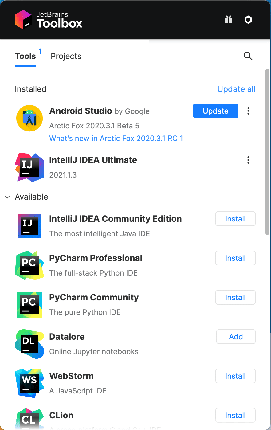
The JetBrains Toolbox App is the single entry point for developing using JetBrains IDEs. It serves as a control panel for tools and projects, and makes installing and updating JetBrains IDEs quick and easy. Originally started in 2015 as a hackathon project, the application now serves one million monthly active users, and helps them be more productive with their JetBrains products.

Read on to understand how the Toolbox team moved their application from C++ and JavaScript to 100% Kotlin and Compose Multiplatform, and ended up making their code easier to maintain and work with while shipping smaller artifacts with better runtime performance.

To hear the story directly from Victor Kropp, who leads the Toolbox team at JetBrains, check out Talking Kotlin #107:

Victor, can you introduce the architecture and tech stack used by JetBrains Toolbox?

The Toolbox App is a typical client-server application. The desktop app requests a list of available tools from the server, shows it to the user, and downloads updates for JetBrains products when required. We implemented the server-side part of our application in Kotlin from the very beginning. The desktop application, however, was a different story.

When we started building the desktop app for JetBrains Toolbox back in 2015, we used C++ to implement its business logic and used the Chromium Embedded Framework together with React and HTML/CSS/JS to build the user interface. We made this choice at a time when Kotlin 1.0 hadn’t been released yet – and neither was the modular JDK, which came with Java 9. We couldn’t afford bundling a Java Runtime Environment (JRE) weighing hundreds of megabytes for our small helper application, and we didn’t want to trouble our users with having to manually set up their environment. So, we chose a completely different approach.

In 2021, we completed the final step of making the desktop application 100% Kotlin by migrating the user interface from React to Compose Multiplatform, more specifically Compose for Desktop.

Visit the Compose for Desktop website

How do you use Kotlin and its libraries in your product?

With the migration to Kotlin completed, we use it everywhere. Besides Compose for Desktop powering the user interface, we make heavy use of kotlinx.coroutines for all asynchronous jobs. The Toolbox App manipulates a lot of JSON objects, so we naturally use kotlinx.serialization for (de)serialization.

The server side is kept as simple as possible. In fact, it isn’t an HTTP Server as you might imagine it. All of the information and descriptions for installable tools (called “feeds” in Toolbox) are generated statically and served as JSON files from the CDN. They don’t change often, so we update them only when a new version of any tool is released as part of the continuous delivery pipeline on TeamCity. The generator is a simple command line Kotlin program that is invoked as a “build configuration” (TeamCity’s name for a job), which is automatically triggered on each build of every supported product. A second job then periodically merges all newly generated feeds, discards the outdated ones, and performs validation.

Why did the Toolbox team decide to use Kotlin for Desktop application development?

Before moving to Compose for Desktop, we used the Chromium Embedded Framework to build the user interface for the Toolbox App, and using native C++ for our business logic helped us support all major desktop operating systems easily. (Since then, many things have changed, and we made the decision to move all C++ business logic to Kotlin running on the JVM in 2020.)

Back in 2015, those were great choices to kickstart the project! We were able to reuse components from Ring UI, a library of web UI components built by JetBrains. We also already had a lot of previous experience in web development and working with React.

However, it had its disadvantages:

  • The Chromium Embedded Framework is known for its resource consumption. Even when idle, JetBrains Toolbox would use at least 200 MiB of RAM. We also couldn’t unload the whole framework when the window was invisible, because it would result in a multi-second delay for our users when trying to interact with the app.
  • We needed a full-blown client-server architecture inside a single desktop application. The embedded web UI and the business logic were written in different languages and by different people. This complicated the development process and required the resources to send megabytes of JSON back and forth inside the application, using up CPU resources on the (de)serialization of data that was already there.

After moving our application to 100% Kotlin, that situation has improved significantly:

  • Compose for Desktop is now much less resource intensive. The Compose framework provides better runtime performance compared to our JavaScript implementation, and when running idly in the background, we managed to greatly reduce the RAM used by the app.
  • Using a single language means that every developer can make a feature from start to finish without switching contexts. It is faster, less error prone, and improves knowledge sharing among developers. The entire application also uses the same representation for data in memory, skipping the need for extra (de)serialization steps.

Can you share your experience of introducing Kotlin to your Toolbox?

We faced many challenges. First of all, we needed to migrate a five year-old codebase, with all its features and quirks, to a different stack. To ensure that the core of our application works as intended, we migrated all of our unit tests. However, our application requires a lot of external dependencies, which obviously vary in different ecosystems. Some things didn’t work in the previous implementation and started working in the new one without any action from our side, simply because the new dependency supported them. However, other things we took for granted stopped working. In some cases, we didn’t know about those differences until after a public release. Examples for both categories are the different aspects of operating system integration, like the system tray (menubar) icon, or proxy servers and SSL certificates. On the other hand, it also allowed us to reuse Kotlin code written by other teams at JetBrains, like reusing the code powering IntelliJ IDEA’s project search in the Toolbox’s “Projects” tab or detecting specific enterprise setups.

We started using Compose for Desktop before it was even publicly announced, so we were often the first to encounter any issues that arose with the framework. As pioneers of Compose for Desktop, we noted all sorts of problems when we started, and reported all of them to our colleagues in the Compose Multiplatform team. They were very helpful and responsive and fixed all of them very quickly. At times, we were able to get a new release with a fix on the same day – very impressive! They also greatly helped us with the adoption of Compose and in cases where we were struggling with the framework.

We were able to make a full clone of our previous design. At first glance, Compose offers fewer layout primitives compared to what we had in HTML/CSS, but it quickly became apparent that simple horizontal and vertical stacks (Row and Column in Compose) already covered 99% of all our needs. When we first started, Compose for Desktop was still missing some pieces, like support for SVG graphics, but our colleagues from the Compose team helped us cover these needs very quickly.

Initially, we used Compose’s Material components throughout the application. These are very well-thought-out components, but they focus on touch interfaces. This means that all elements have large paddings (so they can be easily pressed with a finger), don’t have hover states (given there is no such thing on touch displays), and have very prominent visual touch feedback. On desktop, the story is usually quite different, as components react when hovered over, and the visual feedback for clicks only affects the current element (because it is not covered by a finger). Because of that, we are replacing Material components with our own which work better on desktop. We also have plans to open-source our components library in the future, so stay tuned for that.

Did you consider any other UI frameworks before choosing Compose for Desktop?

One alternative would have been to convert the application to a fully native interface, but it would have required three times more effort per feature. We wanted something that would be cross-platform, look nice, and work well with Kotlin.

We felt that Swing was too old and the usage of JavaFX isn’t sufficiently widespread. That’s how we landed on Compose for Desktop, despite it just being announced at the time. Getting direct support from the team and a tight feedback loop also turned out to be a huge plus.

What are the biggest benefits that Kotlin has brought to your product?

Everyday work is just much simpler now. We use the same language across the entire application, meaning the developers on our team share code and knowledge better than before. We’re also having much more fun writing Kotlin instead of C++ and JavaScript!

Do you have any advice or recommendations for our readers?

If you are converting an existing application to a new framework, don’t underestimate the complexity of migration. It is almost like writing a new application from scratch and then some! You’ll inevitably need to re-implement not only the features, but also all of the little nuances in your app’s behavior, whether those are intentional or not.

I strongly believe that Compose for Desktop is the way to create cross-platform desktop applications in 2021. Compared to similar technologies, Kotlin provides access to a tried and tested ecosystem on the JVM, has much greater adoption than Dart and Flutter, and it is far more efficient than Electron with React/JS.

Build your first desktop app with Compose for Desktop

Victor Kropp is the Team Lead for the JetBrains Toolbox App.

Continue ReadingJetBrains Toolbox Case Study: Moving 1M users to Kotlin & Compose Multiplatform

Compose Multiplatform 1.0 is going live!

Compose Multiplatform by JetBrains, the declarative UI framework for Kotlin, has reached version 1.0, which makes it ready for production use! Here are a few highlights that we hope will make you as excited about the release of this framework as we are:

  • On desktop, you can now create Kotlin apps with beautiful user interfaces quickly and efficiently.
  • On the web, you can now build production-quality dynamic web experiences using Compose for Web’s stable DOM API with full interoperability with all browser APIs. Support for Material UI widgets will be available in a future release.
  • Overall, sharing expertise and code between various platforms (including Android, using compatibility with Jetpack Compose by Google) is much easier now.

Let’s go over them one by one.

Visit the website

Kotlin UI for Desktop

For quite some time, if you wanted to build a user interface for your Kotlin desktop application, you had to use traditional Java UI frameworks as there haven’t been any Kotlin libraries that embraced a modern UI development style for the desktop. We’re changing this by offering Compose Multiplatform. Let’s explore how this framework improves the experience of writing UIs for Kotlin apps.

A declarative approach to building user interfaces

Compose Multiplatform is declarative, so your code reflects the UI structure of your app and you don’t need to worry about things like copying data from model to view or developing UI refreshing logic. Since the framework takes care of all of that for you, developing UIs is truly a pleasure. In this example, the content of the Text label will be updated once content of the TextField is edited without any additional code:

var text by remember { mutableStateOf("Hello, World!") }
Column {
   Text(text) //text label
   TextField(text, {text = it}) //text field
}

It’s easy to get started with Compose Multiplatform, especially if you’ve used a declarative UI framework like React or Jetpack Compose by Google before. Compose Multiplatform uses many of the same concepts, so you should feel right at home.

Great runtime performance via hardware acceleration

Modern user interfaces are performance-sensitive and we go to great lengths to improve the speed of Compose Multiplatform. It uses Skia, a well-optimized graphics library that is used by many performance-sensitive applications, including modern browsers. This means Compose Multiplatform supports all major hardware acceleration engines on the Desktop, such as DirectX, Metal, and OpenGL. For environments where hardware acceleration is not available, Compose comes with an optimized software renderer.

Short iteration cycles via the Preview Tool

One of the most time-consuming tasks in UI development is rebuilding an application in an attempt to make it look perfect. The Compose Multiplatform IDEA plugin streamlines this process. Its builtin live preview feature allows you to fine-tune your components/parts of the UI, and create multiple iterations of them without having to rebuild or restart the application. This shortens the development cycle significantly.

Confidently delivering desktop apps with automatic application packaging

Bringing an application to its users requires not only proper development, but proper packaging too. This is another area where Compose Multiplatform provides assistance. Its Gradle plugin supports application packaging to the msi, dmg and deb formats, including signing and notarization for MacOS.

Interoperability with Jetpack Compose on Android and Java UI frameworks

Jetpack Compose, Android’s modern toolkit for building native UIs created by Google, is continually gaining popularity among mobile developers. If you’ve used it before, it will be extremely easy for you to use Compose Multiplatform, as these two frameworks share a large part of their APIs.

If you’re working on Desktop applications that already have a user interface built with typical Java UI frameworks, you don’t need to rewrite your code from scratch to make it work with Compose Multiplatform. We provide excellent interoperability, meaning you can add UI components written with Compose to your existing Java UI. You can also add your existing Java controls to any new app you build with Compose Multiplatform.

Get up and running quickly with the Compose Multiplatform wizards

Getting started with Compose Multiplatform is easier than ever. In IntelliJ IDEA 2021.1+, you can create a simple Compose Multiplatform project in just a few clicks.

New Project wizard showing the "Compose Desktop Application" example

We also have a wide variety of tutorials to help you get acquainted with the desktop target for Compose Multiplatform.

Compose for Web

Beyond the Desktop, Compose Multiplatform gives you a powerful, declarative Kotlin/JS API for working with the DOM.

It has all the features you want and need in a modern web framework, including a comprehensive DOM API, built-in CSS-in-JS support, support for SVGs, typed inputs, and many others. The web target for Compose Multiplatform is written in pure Kotlin and takes full advantage of the type system and idioms the language has to offer. This allows you to use the same development workflow you may already be used to from other Kotlin targets.

Multiplatform support

Using Compose Multiplatform, you’re not limited to targeting Desktop and Web Platforms (which are supported directly). You can also target Android using the well-known UI Framework Jetpack Compose, developed by Google. These two frameworks share common APIs and Core, giving them perfect interoperability. This means you don’t have to re-write common UI and state management code. Just write it once and then reuse it on as many platforms as necessary.

If you have an existing Android application that you want to bring to the desktop or web, Compose Multiplatform helps you do so with minimal effort. It allows you to manage all the targets of your application from a single Kotlin project.

To quickly get started with building an app that targets multiple platforms with Compose, you can use the Kotlin Project Wizard in IntelliJ IDEA 2021.1+.

And even if you don’t need to develop a multiplatform application right now, your knowledge and expertise from one platform will be really helpful on another.

What has changed since beta?

For Compose Multiplatform 1.0, we focused entirely on making sure that the framework is truly ready for use in your production application. As a result, this release primarily addresses quality and stability while fixing critical issues and bugs.

Real production experience

Even though Compose Multiplatform hasn’t gone live until today, there are some production applications that already use it. For example, at JetBrains we started adopting Compose Multiplatform in the Jetbrains Toolbox App (https://www.jetbrains.com/toolbox-app/) as far back as early 2021. This management application for JetBrains IDEs is used by more than 1,000,000 monthly active users and was fully migrated from C++ and Electron to Compose Multiplatform 4 months ago.

Wrapping up

With Compose Multiplatform, Kotlin developers now have a powerful framework to create beautiful UIs for both desktop and web applications

Now is the perfect time to give Compose Multiplatform a try! The easiest way to get started is to take a look at the official tutorials. Using the Kotlin Project Wizard that’s built into IntelliJ IDEA 2021.1+, you can create your first Compose Multiplatform project and start building declarative user interfaces with Kotlin.

We hope you enjoy it!

Continue ReadingCompose Multiplatform 1.0 is going live!

Compose Multiplatform Goes Beta: Stabilized APIs, Compatibility with Google’s Compose Artifacts, and More

Compose Multiplatform, the declarative UI framework for Kotlin, has reached Beta. This brings Compose for Desktop and Compose for Web another step closer to their stable release later this year. Here are the highlights:

In this blog post, we will cover all the details about the major changes with this release.

Stabilizing APIs

As we are moving towards the first stable release of Compose Multiplatform, we are proceeding with the stabilization of its APIs. Starting with this release, APIs which we believe might change in the future are annotated as experimental. Going forward, you can consider APIs that are not explicitly marked as experimental to be mostly stable.

As an example of an interface that could still change before 1.0, we can take mouseScrollFilter: it’s an API for managing scroll events, currently only available in Compose for Desktop. We want to make it available for all platforms – but such a commonization could obviously lead to some changes in its interface. Another example is mouseMoveFilter – we haven’t received enough feedback on its usage yet to fully determine whether its current form will also be its final form. As we gather more input from users, we may still consider applying some changes.

For a comprehensive list of all the API changes in this release, feel free to refer to the changelog in the official Compose Multiplatform repository. In this blog post, we’ll just be looking at the highlights.

Compatibility with Google’s Compose artifacts

Previously, Compose Multiplatform contained artifacts for Desktop, Web and Android. This caused issues when the framework was used simultaneously with Compose Android artifacts published by Google (e.g. when one framework was used together with a library based on another framework).

With Compose Multiplatform Beta, we have stopped publishing Android artifacts ourselves. Instead, Compose Multiplatform now refers to Google’s artifacts directly. This approach prevents typical issues, such as duplicate class conflicts. Developers will be able to use Compose without thinking about the artifact publisher, and library authors will be able to support Compose Multiplatform and Android-only Jetpack Compose use cases without having to deal with compatibility issues.

What’s new in Compose for Desktop

In the Beta release of Compose Multiplatform, the desktop target benefits from performance and rendering stability improvements, accessibility support on MacOS, and refined APIs for controlling user interactions.

Rendering fallbacks and improved software rendering

By default, Compose for Desktop uses hardware-accelerated rendering via DirectX, OpenGL, and Metal. However, there is a near-infinite combination of graphics hardware and drivers on the market that can introduce all kinds of rendering problems. Nevertheless, we want to ensure that any applications you build with Compose for Desktop still run on these systems.

To address this, we’re introducing automatic rendering fallbacks for Compose for Desktop. They ensure that even when certain rendering technologies have issues on the target system, your application will remain usable. For example, if the system running your application encounters issues with the DirectX renderer, Compose for Desktop will change to an OpenGL-based rendering strategy. If OpenGL has incompatibilities or problems, your app will automatically switch to software rendering.

The software renderer (the most basic and most widely compatible rendering backend in Compose for Desktop) also receives some massive performance boosts with this release. Our benchmarks show that the optimizations included with this release make the rendering process at least 50% faster, with some systems seeing rendering times being cut in half.

New mouse pointer APIs

In this release, the mouse pointer APIs have been reworked and extended. The pointerInput modifier has been extended with the PointerEventType.Enter and PointerEventType.Exit events, which can be retrieved inside an awaitPointerEventScope:

val text = remember{ mutableStateOf("Start")}
var modifier = Modifier.pointerInput(Unit) {
   while (true) {
       val event = awaitPointerEventScope { awaitPointerEvent() }
       when (event.type) {
           PointerEventType.Enter -> text.value = "Enter"
           PointerEventType.Exit -> text.value = "Left"
       }
   }
}

Button(onClick = {}, modifier) {
   Text(text.value)
}

This low-level API also serves as the foundation for the convenient new hoverable API.

Hoverables

We’re introducing an extra modifier for a common type of mouse events – hovering. This modifier allows you to access the hover state of a composable without having to use the lower-level mouse events API. You can instead query the hover state of a composable directly:

val interactionSource = remember { MutableInteractionSource() }
val isHovered by interactionSource.collectIsHoveredAsState()
Box(
   Modifier
       .hoverable(interactionSource = interactionSource)
       .background(if (isHovered) Color.Red else Color.Green)
       .size(128.dp)
)

Transparent window support

The era of purely rectangular Compose for Desktop windows is over! You can now make the background for your application’s window transparent. Together with disabled window decorations, this gives you full control over how the user interface is rendered. Whether your app uses custom rounded corners for its window or renders free-floating buttons on the user’s desktop, transparent windows provide access to a new category of designs that you can easily implement:

A sample user interface that uses custom window decorations and rounded corners by using Compose for Desktop’s transparent window support
fun main() = application {
   var isOpen by remember { mutableStateOf(true) }
   if (isOpen) {
       Window(
           onCloseRequest = { isOpen = false },
           title = "Transparent Window Example",
           transparent = true,
           undecorated = true, //transparent window must be undecorated
       ) {
           Surface(
               modifier = Modifier.fillMaxSize().padding(5.dp).shadow(3.dp, RoundedCornerShape(20.dp)),
               color = Color(55, 55, 55),
               shape = RoundedCornerShape(20.dp) //window has round corners now
           ) {
               Box(modifier = Modifier.fillMaxWidth(), contentAlignment = Alignment.BottomEnd) {
                   Button(
                       onClick = { isOpen = false },
                       modifier = Modifier.padding(20.dp).align(Alignment.BottomCenter),
                       colors = ButtonDefaults.buttonColors(backgroundColor = Color(75, 75, 75)),
                   ) {
                       Text("Close", color = Color(200, 200, 200))
                   }
               }
           }
       }
   }
}

Preview: accessibility support on macOS

We want to make sure that the applications you build with Compose for Desktop are accessible to everyone, including users with disabilities. In order to increase the accessibility of your applications for blind users and those with low vision, this release includes preview support for Apple’s VoiceOver, the screen reader built into macOS.

So far, these accessibility features are only available on macOS, but we’re hoping to add support for Windows soon. Accessibility for cross-platform applications remains a technical challenge. We’ll talk more about making Compose Multiplatform accessible for everyone in a follow-up blog post on the topic.

What’s new in Compose for Web

The Beta version of Compose Multiplatform also comes with new additions to its web target. In Compose for Web, your composables create a DOM tree – a tree of HTML nodes, which the browser then renders using its layout engine. Now, we are adding support for composable scalable vector graphics.

Composable SVG support

With this release, we’ve extended the APIs to also allow you to declaratively define SVGs – Scalable Vector Graphics – using the @Composable API. This means you can now define and embed vector images in your web applications that react to changes in the application’s state, once again leveraging a powerful and type-safe Kotlin DSL.

@ExperimentalComposeWebSvgApi
@Composable
fun svgDemo() {
   Div() {
       Svg(viewBox = "0 0 200 200") {
           var currentColor by remember { mutableStateOf(0) }
           val colors = listOf(
               rgb(200, 0, 0),
               rgb(100, 0, 0),
               rgb(100, 20, 0),
               rgb(20, 100, 0)
           )
           SvgText("Click the circle!", x = 20, y = 20)
           Circle(100, 100, 20, {
               attr("fill", colors[currentColor].toString())
               onClick {
                   currentColor = (currentColor + 1).mod(colors.size)
               }
           })
       }
   }
}

We’re almost there: expect 1.0 soon!

Compose Multiplatform is now in Beta! Most of the APIs are now very close to being stable, and we are not expecting any major API changes before the final release. We’re putting the finishing touches on Compose Multiplatform, and you can look forward to its stable, 1.0 release sometime later this year.

Try out Compose Multiplatform Beta!

Whatever combination of web, desktop, and Android you may target – we hope you’ll give this version of Compose Multiplatform a try! Evaluate Compose Multiplatform for your production applications, or build your next MVP using our declarative UI framework!

We offer a variety of resources to help you get started:

If you’re upgrading an existing application, and want to use Compose Multiplatform Beta, add the following to your settings.gradle.kts file:

pluginManagement {
   repositories {
       gradlePluginPortal() //compose beta plugin is published here
   }
}

Additionally, make sure that you specify the correct dependencies for Compose Multiplatform in your build.gradle.kts:

import org.jetbrains.compose.*
import org.jetbrains.compose.desktop.application.dsl.TargetFormat
import org.jetbrains.kotlin.gradle.tasks.KotlinCompile

plugins {
   kotlin("jvm") version "1.5.31"
   id("org.jetbrains.compose") version "1.0.0-beta5"
   //add other plugins here if needed
}

repositories {
   google()
   mavenCentral()
   jetbrainsCompose()  //repository that contains Compose MPP artifacts
}

dependencies {
   implementation(compose.desktop.currentOs) //for desktop
   implementation(compose.web.core) //for web
   implementation(compose.web.svg) //for web
   implementation(compose.runtime) //for web
}

Share your feedback and join the discussion

The stable release of Compose Multiplatform is already on the horizon. That’s why we are once again asking for your feedback. Help us help you by reporting problems, telling us about APIs that you feel are missing, and requesting features you’d like to see. You can do all of this in the project’s issue tracker.

If you want to talk to other developers and team members, we also invite you to join the discussion on the Kotlin Slack. In the #compose-desktop and #compose-web channels, you can find discussions about Compose for Desktop and Web, respectively. In #compose you can discuss general topics involving Compose and Jetpack Compose for Android.

We can’t wait to see what you’ll build next with Compose Multiplatform! Take care!

See also

Continue ReadingCompose Multiplatform Goes Beta: Stabilized APIs, Compatibility with Google’s Compose Artifacts, and More

Compose Multiplatform goes Alpha, unifying Desktop, Web, and Android UIs

Today’s release marks another step in our grand unified theory of UI development with Kotlin! We have a lot of news to talk about for our multiplatform UI efforts, including Compose for Desktop and Compose for Web. Today’s announcement builds on Google’s news last week that Jetpack Compose is now in 1.0 stable for Android. Here are the highlights:

  • Compose for Desktop and Compose for Web are being promoted to Alpha. Their versioning is now aligned under the Compose Multiplatform umbrella, making it possible to build Android, Desktop, and Web UIs with the same artifacts.
  • The JetBrains Toolbox App, our management application for IDEs, has finished migration to Compose for Desktop.
  • A new plugin for IntelliJ IDEA and Android Studio enables component previews for Compose for Desktop via the @Preview annotation.
  • Compose for Desktop now uses the composable window API by default, providing new support for adaptive window sizes, unified image resources, and new platform support for Linux on ARM64, allowing you to run it on targets like Raspberry Pi.
  • Compose for Web further extends its DOM and CSS APIs.

We’ve also outlined the path of Compose in our video The Compose Story and shared exciting news about where we want to take declarative multiplatform user interfaces next. Read on and find out more!

Unifying Desktop, Web, and Android UI development

The story of declarative UI development with Kotlin really took off with the introduction of Jetpack Compose by Google, a modern framework for building native user interfaces for Android. JetBrains is building on the foundation of Google’s Jetpack Compose and bringing the Compose framework to new places!

With Compose Multiplatform, we’re making it possible to use the same declarative approach and APIs used for modern Android applications to create user interfaces for desktop and browser apps powered by Kotlin on the JVM and Kotlin/JS. Using the mechanisms provided by Kotlin Multiplatform, you can now target any combination of the following from the same project:

  • Android (Jetpack Compose)
  • Desktop (Compose for Desktop)
  • Browser (Compose for Web)

Previously, Compose for Desktop and Compose for Web used separate sets of artifacts. We have now unified them under a single Gradle plugin and group of artifacts, meaning it’s easier than ever to get started with developing Android, desktop, and web user interfaces based on Compose.

With its new Alpha stability level, the APIs provided by Compose Multiplatform are now rapidly approaching their final form. This makes it a great time to write proof-of-concept implementations for your production applications so that you’ll be ready to go all-in on Compose when we hit 1.0, which we anticipate in 2021.

If you’re itching to try it yourself and you want to start writing your own modern UIs using Compose Multiplatform, feel free to read our official tutorials and learning materials. Or read on to learn more about what’s new in this latest release!

Learn more about Compose Multiplatform

How we got here: The Compose Story

To celebrate this significant step in making declarative, multiplatform user interface development with Kotlin a reality, we want to share our Compose story with you. To give you multiple perspectives on these efforts, we have invited Roman Elizarov, Project Lead for Kotlin at JetBrains; Nikolay Igotti, Lead for Compose at JetBrains; Jim Sproch, founder of Compose at Google; and Andrey Rudenko, Software Engineer in Compose UI.

Watch the story here to find out how it all started, how we got to where we are now, and what we plan to do next with Compose Multiplatform:

Compose in Production: JetBrains Toolbox App

Over the last few months, we’ve been watching our community adopt Compose for Desktop and Web in their projects – from small games, productivity helpers, and little demo apps to teams bringing Compose into their production apps.

At JetBrains, we’re now adopting Compose in some of our production applications, starting with the JetBrains Toolbox App, the management app for JetBrains IDEs with more than 800,000 monthly active users.

Toolbox App Screenshot

In their latest release, the team has completely converted the implementation of the application to Compose for Desktop. During the migration from an Electron-based user interface, the team noticed a number of advantages, some of which we’d like to highlight here:

  • Memory consumption was significantly decreased, especially while the application is running in the background
  • The installer size has been reduced by approximately 50%
  • Overall rendering performance of the application has improved significantly

JetBrains Toolbox team lead Victor Kropp also shared his opinion on Compose for Desktop in the post:

Compose for Desktop is still in its early stages, but it has already proved to be a great choice for the Toolbox App. With support from our colleagues who are developing the framework, we were able to rewrite the whole UI in almost no time. This allowed us to unify the development experience, so from business logic to UI, from application to server, Toolbox is now 100% Kotlin.

The story of the JetBrains Toolbox App adopting Kotlin and Compose for Desktop is an inspiring one, and a few paragraphs in our release post certainly can’t do it justice. For that reason, we are planning to share a full-fledged case study on the project in the future. If you’re interested in a more detailed behind-the-scenes look, keep an eye out or subscribe to our newsletter to hear when it arrives!

New IntelliJ IDEA and Android Studio plugin for Compose Multiplatform

With this release, we’re also announcing a new IDE plugin to support you in your development efforts: the Compose Multiplatform plugin for IntelliJ IDEA and Android Studio. It is being released in tandem with new versions of the framework, and provides additional features to help you bring your user interfaces to life.

This first version includes a long-awaited feature: the ability to preview your Compose for Desktop and Android components right in the IDE, without having to even start your application. To show a preview for a @Composable function that takes no parameters, add the @Preview annotation to its definition. This adds a small gutter icon, which you can use to toggle the preview pane for your component:

The plugin adds a gutter icon…
…from which you can trigger a non-interactive preview.

We hope this new preview helps you shorten your development cycle and makes it easier for you to translate ideas and thoughts into real designs and layouts based on Compose. We’ll be updating and extending this plugin with additional functionality in the future to further improve the development experience when using our UI frameworks.

To find and install the new plugin, search for “Compose Multiplatform IDE Support” in the Plugins Marketplace, or click below to open the plugin’s page directly:

Install the Compose Multiplatform Plugin

What’s new in Compose for Desktop

Besides taking the big step of promoting Compose for Desktop to Alpha, we’re also improving its APIs and adding support for a new platform in this release.

Composable Window APIs by Default

In Milestone 4 of Compose for Desktop, we introduced an experimental set of APIs for the management of Window, MenuBar, and Tray. These new APIs are all @Composable, using the same concepts of state management, behavior, and conditional rendering as the other components in your application.

In this release, these composable versions are now the default way of managing windows, menu bars, and tray icons, replacing the old window API. If you haven’t given these new APIs a try, or if you just want to learn more about the behavior and functionality they offer, you can refer to our updated Compose for Desktop tutorials on window and tray management.

Adaptive Window Size

Sometimes we want to show some content as a whole without knowing in advance what exactly will be shown, meaning that we don’t know the optimal window dimensions for it. To make development of these UI scenarios easier, we’ve introduced the adaptive window size feature. By setting one or both dimensions of your window’s WindowSize to Dp.Unspecified, Compose for Desktop will automatically adjust the initial size of your window in that dimension to accommodate its content:

fun main() = application {
   val state = rememberWindowState(width = Dp.Unspecified, height = Dp.Unspecified) //automatic size
   Window(
       onCloseRequest = ::exitApplication,
       state = state,
       title = "Adaptive",
       resizable = false
   ) {
       Column(Modifier.background(Color(0xFFEEEEEE))) {
           Row {
               Text("label 1", Modifier.size(100.dp, 100.dp).padding(10.dp).background(Color.White))
               Text("label 2", Modifier.size(150.dp, 200.dp).padding(5.dp).background(Color.White))
               Text("label 3", Modifier.size(200.dp, 300.dp).padding(25.dp).background(Color.White))
           }
       }
   }
}

Together with removing window decorations (via undecorated = true in your application’s Window definition), we believe this new way of creating dynamically sized windows opens up a lot of additional possibilities for user interfaces that come in all shapes and sizes!

Additional features for composable window menus

Modern desktop applications usually come with rich and complex window menus. In this release, we’ve added additional APIs that allow creating such rich menus. They can be structured, enriched with icons, shortcuts, and mnemonics and integrate widely used logic of checkboxes and single selection lists (radio buttons):

@OptIn(ExperimentalComposeUiApi::class)
@Composable
private fun MenuBarScope.FileMenu() = Menu("Settings", mnemonic = 'S') {
   Item(
       "Reset",
       mnemonic = 'R',
       shortcut = KeyShortcut(Key.R, ctrl = true),
       onClick = { println("Reset") }
   )
   CheckboxItem(
       "Advanced settings",
       mnemonic = 'A',
       checked = isAdvancedSettings,
       onCheckedChange = { isAdvancedSettings = !isAdvancedSettings }
   )
   if (isAdvancedSettings) {
       Menu("Theme") {
           RadioButtonItem(
               "Light",
               mnemonic = 'L',
               icon = ColorCircle(Color.LightGray),
               selected = theme == Theme.Light,
               onClick = { theme = Theme.Light }
           )
           RadioButtonItem(
               "Dark",
               mnemonic = 'D',
               icon = ColorCircle(Color.DarkGray),
               selected = theme == Theme.Dark,
               onClick = { theme = Theme.Dark }
           )
       }
   }
}

Support for context menus

Compose for Desktop Alpha comes with support for default and custom context menus, which can be triggered by clicking the right mouse button. For selectable text and text fields, the framework provides a set of default context menu items, offering your users to copy, paste, cut, and select.

To specify custom context menu entries for your own components, you can provide a hierarchy of components:

@OptIn(ExperimentalComposeUiApi::class, androidx.compose.foundation.ExperimentalFoundationApi::class)
fun main() = singleWindowApplication(title = "Context menu") {
   DesktopMaterialTheme { //it is mandatory for Context Menu
       val text = remember {mutableStateOf("Hello!")}
       ContextMenuDataProvider(
           items = {
               listOf(ContextMenuItem("Clear") { text.value = "" })
           }
       ) {
               TextField(
                   value = text.value,
                   onValueChange = { text.value = it },
                   label = { Text(text = "Input") }
               )
       }
   }
}

Cursor change behavior and pointer icon API

Starting with this version of Compose for Desktop, the mouse pointer now automatically turns into a text selection cursor when hovering over text fields or selectable text, signalling that a text selection is possible, and making your applications feel yet a bit more native.

For your own components, you can also adjust the behavior of the mouse pointer using the newly added pointerIcon modifier, which enables you to change the pointer when hovering over a specific component.

@OptIn(ExperimentalComposeUiApi::class)
@Composable
fun ApplicationScope.pointerIcons() {
   Window(onCloseRequest = ::exitApplication, title = "Pointer icons") {
           Text(
               modifier = Modifier.pointerIcon(PointerIcon.Hand),
               text = "Hand icon!"
           )
   }
}

Mouse Clickable modifier

To give you easy access to the mouse buttons and keyboard modifier keys that are being clicked or pressed while a mouse click is happening, we’re introducing a new API with the .mouseClickable modifier. Adding this modifier to your component allows you to specify a callback that receives a MouseClickScope, which provides you with full information about the event:

@ExperimentalDesktopApi
@Composable
fun ApplicationScope.mouseClickable() {
   Window(onCloseRequest = ::exitApplication, title = "mouseClickable") {
       Box {
           var clickableText by remember { mutableStateOf("Click me!") }

           Text(
               modifier = Modifier.mouseClickable(
                   onClick = {
                       if (buttons.isPrimaryPressed && keyboardModifiers.isShiftPressed)  {
                           clickableText = "Shift + left-mouse click!"
                       } else {
                           clickableText = "Wrong combination, try again!"
                       }
                   }
               ),
               text = clickableText
           )

       }
   }
}

Please note that this API is not final yet – we’re continuing its development and are likely to change it in the future.

Unified image resources and icon painter

On our road to stabilizing Compose for Desktop’s APIs further, we’re continuing to improve and simplify the way you work with graphics. Instead of separating graphics resources into svgResource, imageResource, and vectorXmlResource, you can now use a unified painterResource, which can be used for all three types of graphics:

@Composable
fun ApplicationScope.painterResource() {
   Window(onCloseRequest = ::exitApplication, title = "Image resources") {
       Column {
           Image(
               painter = painterResource("sample.svg"), // Vector
               contentDescription = "Sample",
               modifier = Modifier.fillMaxSize()
           )
           Image(
               painter = painterResource("sample.xml"), // Vector
               contentDescription = "Sample",
               modifier = Modifier.fillMaxSize()
           )
           Image(
               painter = painterResource("sample.png"), // ImageBitmap
               contentDescription = "Sample",
               modifier = Modifier.fillMaxSize()
           )
       }
   }
}

We have also changed the window icon property from java.awt.Image to androidx.compose.ui.graphics.painter.Painter, so you’ll be able to use vector-based icons in addition to raster graphics going forward:

fun vectorWindowIcon() {
   application {
       var icon = painterResource("sample.svg") //vector icon
       Window(onCloseRequest = ::exitApplication, icon = icon) {
           Text("Hello world!")
       }
   }
}

Support for Linux on ARM64

With this release, Compose for Desktop adds support for Linux running on devices with an ARM64-based processor, in addition to the existing x86-64 support. In total, you can now write user interfaces for the following platforms using Compose for Desktop:

  • macOS on x64 and arm64
  • Linux on x64 and arm64
  • Windows on x64

What’s new in Compose for Web

Alongside Compose for Desktop, Compose for Web has also been promoted to Alpha. The two have aligned their versioning scheme and release cycles, as well as extended the available functionality through their DSLs for style and event management.

Extended CSS API

We’re continuing to improve and refine our APIs to specify styling rules through CSS. This latest release adds better support for arithmetic operations, setting properties, and support for animations from within the type-safe DSL.

Arithmetic operations with CSS units

You can now execute any arbitrary operations on CSS numeric values. If you are using an operation on two values of the same unit, you’ll get a new value of the same unit, like in the following example:

val a = 5.px
val b = 20.px
borderBottom(a + b) // 25px

CSS API for setting properties

We have expanded the typesafe access to all of the most-used CSS properties, and cover a large portion of all CSS properties that are supported in modern browsers. This means in most cases, you will be able to benefit from our type-safe API directly. For more exotic properties, or properties that are not yet supported, you can also make assignments via the property function, which takes keys and values directly:

borderWidth(topLeft = 4.px, bottomRight = 10%) // type-safe access!

property("some-exotic-property", "hello-friend") // raw property assignment

Animation API

To make your Compose-based user interfaces even more dynamic, we now provide the option to create CSS animations from within the type-safe DSL:

object AppStyleSheet : StyleSheet() {
   val bounce by keyframes {
       from {
           property("transform", "translateX(50%)")
       }

       to {
           property("transform", "translateX(-50%)")
       }
   }

   val myClass by style {
       animation(bounce) {
           duration(2.s)
           timingFunction(AnimationTimingFunction.EaseIn)
           direction(AnimationDirection.Alternate)
       }
   }
}

If you want to explore those APIs more on your own, be sure to check out our newly added examples, which show off some more advanced CSS animation and DOM manipulation functionality.

Event hierarchy, event listeners, and new input types

Handling events, especially those emitted by input components, is one of the key parts of reacting to changes in a Compose app. In this release, we’ve simplified access to event properties, made it easier to define event listeners, and provided different input types.

Event Types Hierarchy

Previously, most event-based APIs required you to work with the nativeEvent or eventTarget directly in order to access the values of the event you were interested in. Starting with this version of Compose for Web, you now have access to a SyntheticEvent, whose subtypes make it easier to access the relevant properties of the emitted events. SyntheticMouseEvent exposes coordinates, SyntheticInputEvent exposes text values, and SyntheticKeyEvent exposes keystrokes, to name just a few examples:

Div(attrs = {
   onClick { event -> // SyntheticMouseEvent
       val x = event.x
       val y = event.y
   }
})

These new event types aim to provide access to the same properties that [are available for in native events](https://developer.mozilla.org/en-US/docs/Web/API/Event) directly, without having to access the nativeEvent or the event’s target directly.

Inputs

In regular HTML, different input types, from text fields to checkboxes, all share the same tag – input. To make it easier to use these different input types from within the Kotlin DSL, and to provide you with more relevant hints, we have introduced a number of additional functions for creating inputs of different types:

TextInput(value = "text", attrs = {
   onInput { } // all these components have attrs same as HTMLInputElement
})
CheckboxInput(checked = false)
RadioInput(checked = false)
NumberInput(value = 0, min = 0, max = 10)
DateInput(value = 2021-10-10")
TelInput(value = "0123456")
EmailInput()
// and other input types

Event Listeners

We have further unified the functions used for listening to events for different input types. Input-type specific functions for input listeners like onCheckBoxInput have been removed and you can now use onInput or onChange directly, which means you no longer have to search for the correctly named callback:

Input(type = InputType.Text, attrs = {
   onInput { event ->
       val inputValue: String = event.value
   }
})

Input(type = InputType.Checkbox, attrs = {
   onInput { event ->
       val isChecked: Boolean = event.value
   }
})

Try out Compose Multiplatform Alpha!

Whether you’re targeting the web, desktop, Android, or all three – we hope you’ll give Compose Multiplatform a try!

We’re anticipating Compose Multiplatform 1.0 – our first stable release – later this year, so now is the ideal time to stay ahead of the curve and evaluate Compose Multiplatform for your production applications.

To help you get started, there are a number of resources available:

Pre-release notes

Compose Multiplatform is currently in Alpha. While most APIs are now already closely resembling their stable shape, please keep in mind that we may still alter some of the APIs to ensure the final release provides the best development experience possible. As we approach the stable release, we continue to rely on your feedback to help us achieve this!

Share your feedback and join the discussion

As we continue our path to the stable release, we’d like to hear your thoughts and feedback on working with Compose Multiplatform. Help us help you by reporting problems, telling us about APIs that you feel are missing, and requesting features you’d like to see. All this can be done in the project’s issue tracker.

If you want to talk to other developers and team members, we also invite you to join the discussion on the Kotlin Slack. In #compose-desktop you can find discussions about Compose for Desktop, and in #compose you can discuss general topics involving Compose and Jetpack Compose on Android.

Take care, and go build some awesome user interfaces with Compose Multiplatform!

See also

Continue ReadingCompose Multiplatform goes Alpha, unifying Desktop, Web, and Android UIs

End of content

No more pages to load