
Starting today, Compose Multiplatform 1.2 is available for you to use! This latest version of the declarative UI framework for Kotlin brings compatibility with the latest Kotlin version and introduces several powerful features for the desktop target. Specifically, here are the highlights:
- The newly added ProGuard support allows you to minify and obfuscate your application before shipping.
- Focus management is being improved, resulting in better keyboard navigation through form elements.
- A reworked API for handling mouse and keyboard input makes it more convenient to implement actions that react to clicking and dragging.
- We are introducing official support for right-to-left languages (RTL) for layouts and input fields.
- Swing interoperability for focus management and context menus is becoming more seamless.
- As an alternative to the Compose Gradle Plugin, you can now package your Desktop application using the third-party tool Hydraulic Conveyor, which makes it easy to build download pages, notarize your application for multiple platforms, and integrate auto-update functionality in your application.
Let’s look at the new features in Compose Multiplatform 1.2 in detail!
Explore the Compose Multiplatform Website
Support for the ProGuard optimizer and obfuscator
Starting with the latest version of Compose Multiplatform, you can now use ProGuard to improve the performance and size of your bundled application without having to provide special configurations. ProGuard applies optimizing techniques to shrink your code, reducing the size of your final binary. It also optimizes your code, which can provide slight performance improvements by removing unnecessary function calls or object allocations. Optionally, it also allows you to apply code obfuscation to your application.
In our tests, we’ve observed that processing an application with ProGuard significantly reduced the final distribution size for our sample applications.
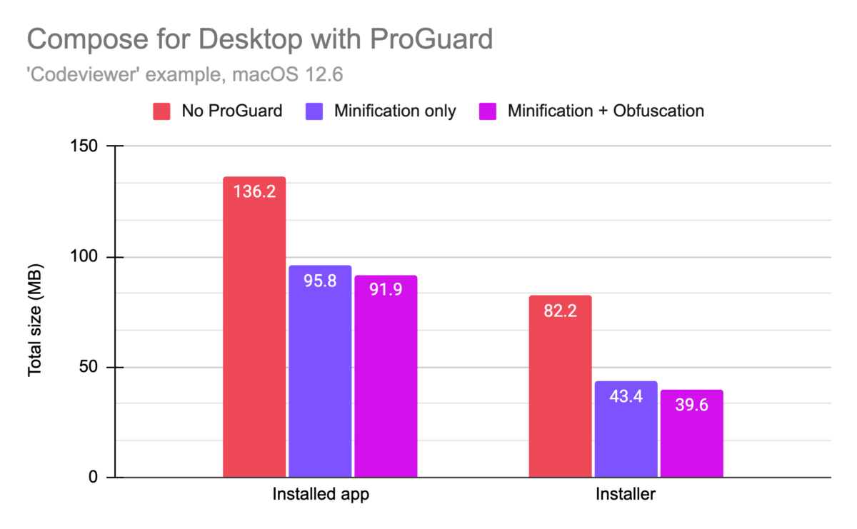
Even without specifying any options in your Gradle configuration for your project, you can use the new runReleaseDistributable and packageRelease<PACKAGE_FORMAT> tasks to process and subsequently run or package your code using ProGuard.
Providing custom ProGuard rules
If your application is using reflection or generates bytecode at runtime, you may need to give ProGuard instructions on which classes should not be removed during the optimization process. You can do so by providing a standard ProGuard configuration file and configuring it in your Gradle build file in the buildTypes.release.proguard block:
compose.desktop {
    application {
        // ...
        buildTypes.release.proguard {
            configurationFiles.from("rules.pro")
        }
    }
}
If you would like to take a closer look at the ProGuard integration provided in Compose Multiplatform, take a look at the example project provided in the GitHub repository.
Improved focus management for keyboard navigation
We have reworked some of the behavior when it comes to managing focus of UI elements, which influences the way users can navigate your elements and inputs via keyboard shortcuts. Both clickable and toggleable elements (with the modifiers Modifier.clickable and Modifier.toggleable) now request focus when clicked, making navigation between focusable items work as users would expect it to (selecting the next focusable item after the one that was clicked). In addition, once an element has been focused, we have also introduced new behaviors that make it easier to use keyboard shortcuts out of the box:
- Composables marked with
Modifier.toggleablecan now be toggled on and off using the spacebar. - The
Slidercomposable can now be controlled via the arrow keys (incrementing values one step at a time), the Page Up and Page Down keys (moving 10% of the value range at a time), and the Home and End keys (set the value to 0% or 100% of the range respectively). - Menu items from
DropDownMenu,CursorDropDownMenu, andContextMenucan now be navigated via the keyboard arrows.
Mouse and keyboard API improvements
We’re also refining Compose for Desktop’s experimental APIs for working with mouse and keyboard input more conveniently. Specifically, we’re introducing the onClick and onDrag modifiers, and making it easier to access modifier keys.
Please note that the mouse and keyboard API is only available on the Desktop target of Compose Multiplatform at the moment.
New onClick modifier
As a replacement for the now deprecated Modifier.mouseClickable, we’re introducing Modifier.onClick. This new modifier gives you fine-grained control over handling clicks of any type using callbacks. Using a PointerMatcher, you can distinguish between different types of clicks (regular, double-click, long click) and the button being used (left mouse button, right mouse button, middle mouse button, etc.). You also have the option to make these callbacks conditional on specific keyboard modifier keys that need to be pressed via the keyboardModifiers lambda parameter.
Box(modifier = Modifier.size(200.dp).background(Color.Yellow)
   .onClick(
       matcher = PointerMatcher.mouse(PointerButton.Secondary), // Right Mouse Button
       keyboardModifiers = { isAltPressed }, // accept clicks only when Alt pressed
       onLongClick = { // optional
           println("Long Click with secondary button and Alt pressed")
       },
       onDoubleClick = { // optional
           println("Double Click with secondary button and Alt pressed")
       },
       onClick = {
           println("Click with secondary button and Alt pressed")
       }
   )
   .onClick { // onClick with all default parameters
       println("Click with primary button (mouse left button)")
   }
) {
   Text(text = "Box with onClick", modifier = Modifier.align(Alignment.Center))
}
If you want to take a look at this API in more detail, we have prepared a tutorial that guides you through using the different options exposed by this modifier, and that also explains how you can chain multiple onClick modifiers to separate different conditions and modifier keys.
New onDrag modifier
Using the onDrag modifier, you can specify a callback that is called on drag events. Just like onClick, it works with a PointerMatcher, meaning you can configure additional constraints, such as which mouse button the drag event should work with. Likewise, you can specify multiple onDrag modifiers that work with different mouse buttons, allowing you to implement different drag behavior for the left and right mouse buttons, for example.
var boxOffset by remember { mutableStateOf(Offset(0f, 0f)) }

Box(modifier = Modifier
   .offset {
       IntOffset(boxOffset.x.toInt(), boxOffset.y.toInt())
   }.size(200.dp).background(Color.Yellow)
   .onDrag(
       matcher = PointerMatcher.mouse(PointerButton.Secondary), // it's Primary by default, can be configured with other pointer buttons such as Secondary, Tertiary, etc.
       onDragStart = { }, // optional
       onDragEnd = { },   // optional
       onDragCancel = { } // optional
   ) {
       println("Drag offset x=${it.x} y=${it.y}")
       boxOffset += it
   }

) {
   Text(text = "Box with onDragn(using right mouse button)", modifier = Modifier.align(Alignment.Center))
}
This also sets this experimental API apart from elements such as the draggable modifier that can be found in the Android target for Compose Multiplatform, which always uses the primary button.
For more information on this API, we have provided a tutorial that includes more extensive usage examples and also illustrates advanced functionality like listening for drag and tap gestures in a PointerInputScope.
Accessing keyboard modifiers
In the context of any composable, you can now use the LocalWindowInfo.current.keyboardModifiers state which provides access to the currently pressed keyboard modifiers (Ctrl, Shift, Alt, or others). Since keyboardModifiers is a state that automatically updates when any modifier keys are pressed or released, composables that are dependent on these keyboard modifiers will recompose.
val windowInfo = LocalWindowInfo.current
var hovered by remember { mutableStateOf(false) }
val color by derivedStateOf {
  if (hovered && windowInfo.keyboardModifiers.isCtrlPressed) {
      Color.Yellow
  } else {
      Color.Gray
  }
}

Box(modifier = Modifier
   .size(200.dp)
   .background(color)
   .onPointerEvent(PointerEventType.Enter) {
       hovered = true
   }.onPointerEvent(PointerEventType.Exit) {
       hovered = false
   }
) {
   Text("Hover me and then press Ctrl", modifier = Modifier.align(Alignment.Center))
}
Support for right-to-left languages and scripts
Starting with version 1.2, Compose for Desktop now supports right-to-left languages. By default, it automatically switches layout and inputs according to the detected system language. If you are implementing behavior that depends on the direction of the script being used, you can use the LocalLayoutDirection CompositionLocal which exposes this information.
Keyboard navigation interoperability and shared context menus with Swing
Combining user interfaces built with Compose for Desktop and those built with Swing becomes a bit more convenient with version 1.2. Using a SwingPanel (which allows you to embed Swing elements in a Compose for Desktop application) or a ComposePanel (embedding Compose for Desktop in your existing Swing applications) now works seamlessly when it comes to keyboard navigation – focusable elements from both UI frameworks now get selected properly when switching via the Tab key.
If you are adding Compose for Desktop to an existing Swing application, you can now use the same context menu for text and text fields across both parts of your application. To do so, you can use the JPopupTextMenu composable.
val localization = LocalLocalization.current
CompositionLocalProvider(
    LocalTextContextMenu provides JPopupTextMenu(owner) { textManager, items ->
        JPopupMenu().apply {
            textManager.cut?.also {
                add(
                    swingItem(localization.cut, Color.RED, KeyEvent.VK_X, it)
                )
            }
            textManager.copy?.also {
                add(
                    swingItem(localization.copy, Color.GREEN, KeyEvent.VK_C, it)
                )
            }
            textManager.paste?.also {
                add(
                    swingItem(localization.paste, Color.BLUE, KeyEvent.VK_V, it)
                )
            }
            textManager.selectAll?.also {
                add(JPopupMenu.Separator())
                add(
                   swingItem(localization.selectAll, Color.BLACK, KeyEvent.VK_A, it)
                )
            }
            ...
        }
    }
) {
    ...
}
We also provide a number of tutorials that provide more details and full samples on Swing interoperability for context menus.
Alternative app distribution with online updates via Conveyor by Hydraulic
With version 1.2, you can use the third-party tool Conveyor by Hydraulic to package your desktop app as an alternative to the Compose Gradle Plugin. Conveyor is free for open-source projects, and is also free for commercial use during its introductory period.
Like with the Compose Gradle Plugin, you can create entirely self-contained applications that come in the native formats of the platforms you are targeting and that come with their own bundled JVM. On top of that, Conveyor adds support for online updates, generating a download page (example), automatic conversion of your icons for the respective platforms, and various other features. Additionally, because Conveyor does not rely on native tooling, you can build, sign, and notarize packages from any operating system.
Conveyor is a great fit for Compose for Desktop, because it drastically simplifies distribution. That makes it smoother to provide online updates and avoid complex multi-platform CI/CD setups. On both Windows and macOS, it also provides extra conveniences for internal or developer-targeted apps: When using the default self-signing mode, the generated download page provides your users with copy-pastable commands to install the app from the terminal (example).
Wrapping up
We hope you enjoy the latest version of Compose Multiplatform and continue to build beautiful UIs for your applications! Some smaller changes didn’t make it into this release post – for a full list of all changes and improvements in Compose Multiplatform 1.2, feel free to take a look at the changelog in the repository.
Starting from version 1.2, Compose Multiplatform comes with support for multiple versions of the Kotlin compiler: The desktop target supports both Kotlin 1.7.10 and Kotlin 1.7.20. The web target currently supports Kotlin 1.7.10, and will provide support for 1.7.20 within the scope of the next minor update.
As usual, the easiest way to get started with this latest version of Compose Multiplatform is to take a look at the official tutorials – or to start exploring on your own using the Kotlin Project Wizard in IntelliJ IDEA. Have fun composing!
Explore the Compose Multiplatform Website