As of today, Compose Multiplatform 1.5.0 is available for you to use. It takes the Jetpack Compose declarative UI framework for Kotlin and extends it beyond Android to desktop, iOS, and web. The desktop version is stable, iOS is in Alpha, and support for web is experimental. For a full introduction, see the Compose Multiplatform website.
Some highlights from this release are:
- The Dialog, Popup, and WindowInsets APIs are now in common code.
- On iOS scrolling, resource management and text fields have been improved.
- The UI testing framework has been stabilized on desktop.
This release is based on Jetpack Compose 1.5, which focuses on performance improvements. It also builds on the 1.1 release of Material Design 3. This includes new components such as date pickers and time pickers.
Try Compose Multiplatform 1.5.0
Compose Multiplatform supports Dialogs, Popups, and WindowInsets
As of version 1.5, dialogs and popups are available in Compose Multiplatform. Dialogs are used for modal events, where the user makes a choice or enters some data. Popups, meanwhile, are for non-modal behavior, such as offering optional functionality.
In this release, the base types Dialog and Popup, as well as DropdownMenu and AlertDialog, are accessible from within common code. This avoids the need to provide platform-specific functionality.
For example, the Composable below is written entirely in common code:
@Composable
fun CommonDialog() {
   var isDialogOpen by remember { mutableStateOf(false) }
   Button(onClick = { isDialogOpen = true }) {
       Text("Open")
   }
   if (isDialogOpen) {
       AlertDialog(
           onDismissRequest = { },
           confirmButton = {
               Button(onClick = { isDialogOpen = false }) {
                   Text("OK")
               }
           },
           title = { Text("Alert Dialog") },
           text = { Text("Lore ipsum") },
       )
   }
}
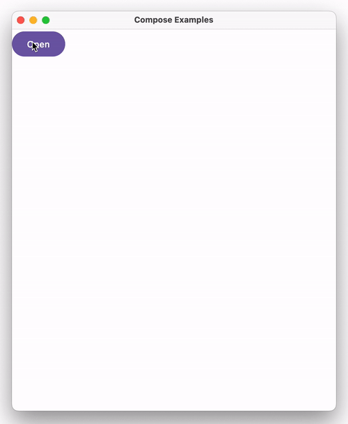
This is how it will appear on desktop:
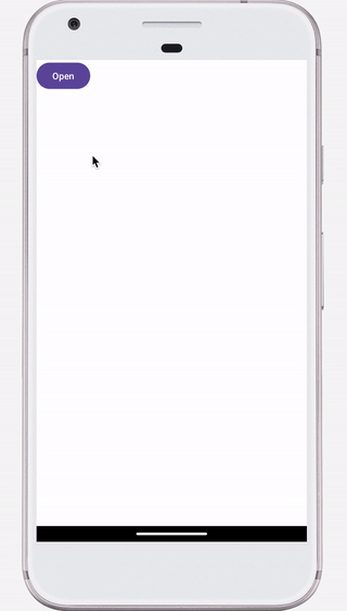
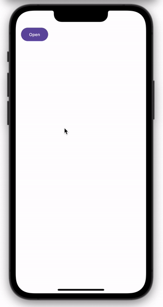
And this is how it will look on Android and iOS:
A third feature, available in this release, is the WindowInsets API, which describes how much adjustment is required to prevent your content overlapping with the system UI. From version 1.5, this functionality is included with Compose Multiplatform, and so can be used on both Android and iOS.
Using the WindowInsets API, you can draw background content via Compose Multiplatform behind the notch. This is done without adding a white line on top of the application. The screenshots below illustrate the difference this makes:

Improvements on iOS
The iOS platform was the focus of this release, and includes a wide variety of improvements. Scrolling mimics the platform’s look and feel, resource management has been simplified, and text handling is enhanced.
Natural scrolling
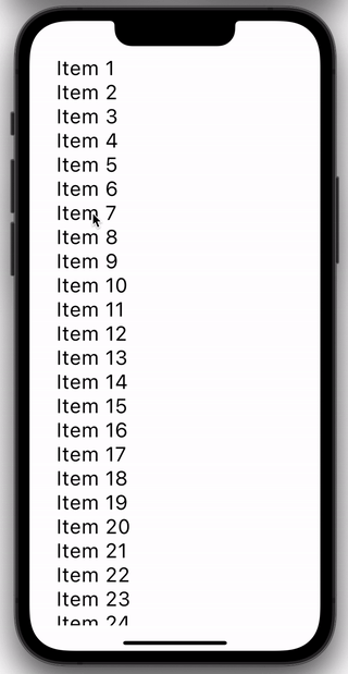
In this release, iOS scrolling is adapted to mimic native scrolling. Let’s say we have code where the number and/or size of items to be displayed exceeds the available space:
@Composable
fun NaturalScrolling() {
   val items = (1..30).map { "Item $it" }
   LazyColumn {
       items(items) {
           Text(
               text = it,
               fontSize = 30.sp,
               modifier = Modifier.padding(start = 20.dp)
           )
       }
   }
}
When scrolling, items spring from the edges of the screen, as with native iPhone applications:
Support for Dynamic Type
The Dynamic Type feature on iOS allows a user to set their preferred font size – larger for ease of viewing or smaller to fit in more content. The text sizing used within an app should be relative to this system setting.
This feature is now supported in Compose Multiplatform. The increments used in scaling the text are the same as those used in native applications, so the behavior will be identical.
For example, given the following Composable:
@Composable
fun DynamicType() {
   Text("This is some sample text", fontSize = 30.sp)
}
This is what will be displayed when the preferred reading size is set to the minimum:

Whereas, this is the result when the preferred reading size is at the maximum:

Support for high-refresh rate displays
In previous versions, the maximum frame rate was 60 FPS. This could result in the UI being slow and laggy on devices with 120Hz screens. From this release, frame rates of up to 120 FPS are supported.
Simplified resource management
From 1.5.0 onwards, any assets in the resources folder of an iOS source set are copied into the application bundle by default. So, for example, if you place an image file into src/commonMain/resources/, it will be copied to the bundle and is usable from your code.
If you are using CocoaPods, you no longer need to configure this behavior in the Gradle build file. You also don’t need to reinvoke podInstall to ensure assets are copied after modification.
From this release, if you try to configure the behavior explicitly in build scripts (as shown below), then you will receive an error:
kotlin {
    cocoapods {
        extraSpecAttributes["resources"] = "..."
    }
}
For full details, and a guide to migrating existing code, please see this document.
Improved TextField
In earlier releases, there were two situations where entering text could cause unwanted behavior. From this release, TextField has been enhanced to overcome these issues.
Capitalization issues
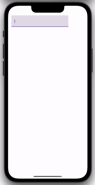
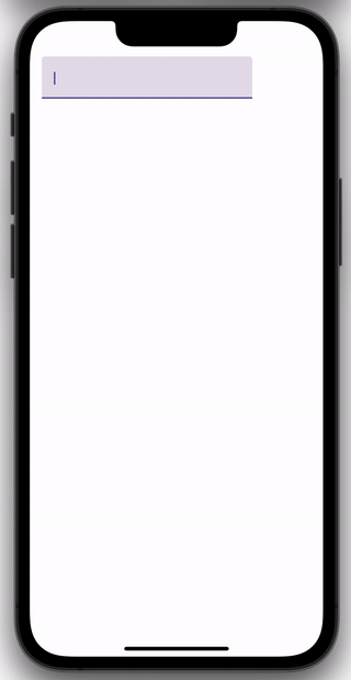
Firstly, TextField now recognizes when the automatic capitalization of the first letter has been disabled. This is important, for example, when entering passwords. You control this behavior via the keyboardOptions argument.
To illustrate this, examine the Composable below:
fun TextFieldCapitalization() {
   var text by remember { mutableStateOf("") }
   TextField(
       value = text,
       onValueChange = { text = it },
       keyboardOptions = KeyboardOptions(
           capitalization = KeyboardCapitalization.Sentences,
           autoCorrect = false,
           keyboardType = KeyboardType.Ascii,
       ),
   )
}
The image on the left shows what happens when the capitalization property is set to KeyboardCapitalization.None, whereas the image on the right shows what happens when the value is KeyboardCapitalization.Sentences.
Hardware keyboards
The second situation relates to hardware keyboards. In previous versions, when using a hardware keyboard, pressing Enter resulted in multiple newlines, and pressing Backspace triggered multiple deletions. From this release, these events are now processed correctly.
Improvements on desktop
Stabilized test framework
This release stabilizes support for testing on Compose for desktop. Jetpack Compose provides a set of testing APIs to verify the behavior of your Compose code. These APIs were ported to desktop and available in previous releases, but with limitations. These limitations have now been removed, making it possible to write comprehensive UI tests for your application.
In order to provide an overview of the testing functionality, let’s create and test a simple UI. Here’s our example Composable:
@Composable
fun App() {
   var searchText by remember { mutableStateOf("cats") }
   val searchHistory = remember { mutableStateListOf<String>() }


   Column(modifier = Modifier.padding(30.dp)) {
       TextField(
           modifier = Modifier.testTag("searchText"),
           value = searchText,
           onValueChange = {
               searchText = it
           }
       )
       Button(
           modifier = Modifier.testTag("search"),
           onClick = {
               searchHistory.add("You searched for: $searchText")
           }
       ) {
           Text("Search")
       }
       LazyColumn {
           items(searchHistory) {
               Text(
                   text = it,
                   fontSize = 20.sp,
                   modifier = Modifier.padding(start = 10.dp).testTag("attempt")
               )
           }
       }
   }
}
This creates a simple UI that records search attempts:
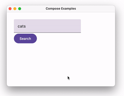
Notice that Modifier.testTag has been used to assign names to TextField, Button and the items in LazyColumn.
We can then manipulate the UI within a JUnit test:
class SearchAppTest {
   @get:Rule
   val compose = createComposeRule()


   @Test
   fun `Should display search attempts`() {
       compose.setContent {
           App()
       }


       val testSearches = listOf("cats", "dogs", "fish", "birds")


       for (text in testSearches) {
           compose.onNodeWithTag("searchText").performTextReplacement(text)
           compose.onNodeWithTag("search").performClick()
       }


       val lastAttempt = compose
           .onAllNodesWithTag("attempt")
           .assertCountEquals(testSearches.size)
           .onLast()


       val expectedText = "You searched for: ${testSearches.last()}"
       lastAttempt.assert(hasText(expectedText))
   }
}
Using the Compose-specific JUnit rule we:
- Set the content of the UI as the App Composable.
- Locate the text field and button via
onNodeWithTag. - Repeatedly enter sample values into the text field and click the button.
- Find all the text nodes that were generated via
onAllNodesWithTag. - Assert that the current number of text nodes were created, and acquire the last.
- Assert that this last attempt contains the expected message.
Enhanced Swing interop
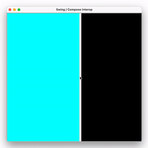
This release introduces experimental support for improved rendering of compose panels inside Swing components. This prevents transitional rendering issues when panels are being shown, hidden, or resized. It also enables proper layering when combining Swing components and compose panels. A Swing component can now be shown above or beneath a ComposePanel.
To illustrate this, examine the example below:
fun main() {
   System.setProperty("compose.swing.render.on.graphics", "true")
   SwingUtilities.invokeLater {
       val composePanel = ComposePanel().apply {
           setContent {
               Box(modifier = Modifier.background(Color.Black).fillMaxSize())
           }
       }


       val popup = object : JComponent() { ... }


       val rightPanel = JLayeredPane().apply {
           add(composePanel)
           add(popup)
           ...
       }


       val leftPanel = JPanel().apply { background = CYAN }


       val splitter = JSplitPane(..., leftPanel,rightPanel)


       JFrame().apply {
           add(splitter)
           setSize(600, 600)
           isVisible = true
       }
   }
}
In this code, we create and display a Swing JFrame, with the following content:
- The JFrame contains a
JSplitPanewith a vertical divider. - On the left of the split pane is a standard
JPanel, colored cyan. - On the right is a
JLayeredPane, made up of two layers:- A
ComposePanelcontaining aBoxcomposable, colored black - A custom Swing component, where the text “Popup” appears within a white rectangle. This is achieved by overriding the
paintComponentmethod.
- A
When the property compose.swing.render.on.graphics is set to true then:
- The custom Swing component is displayed on top of the
BoxComposable. - There are no transitional graphical artifacts as the slider is moved.
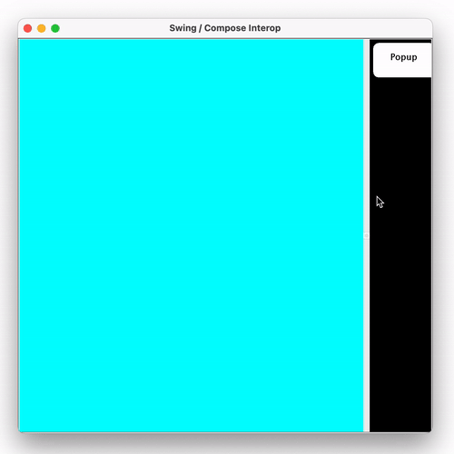
If this flag had not been set, the custom component would not be visible, and there could be transitional artifacts as the slider was moved:
Please share your feedback about Compose Multiplatform. We invite you to join the discussion on the Kotlin Slack in the #compose channel, where you can discuss general topics related to Compose Multiplatform and Jetpack Compose. In #compose-ios, you can find discussions about Compose Multiplatform for iOS.
Try Compose Multiplatform 1.5.0
